Airline App
Role
UX Design
Diploma in UX Design project @ UXDI, 2020
Benchmarking, Online Survey, Usability testing, Depth Interviews, Affinity Diagram, Customer Journey Mapping, Interaction Design, Prototyping
Brief
The task was to design a new website or mobile app for an airline. The focus was specifically on the flight booking process: how users search for, find and select flights online. I had to conduct research on existing flight booking and travel websites/apps in order to design a fast, easy, and intuitive user experience. I have focused on the design of a mobile app.
Empathize
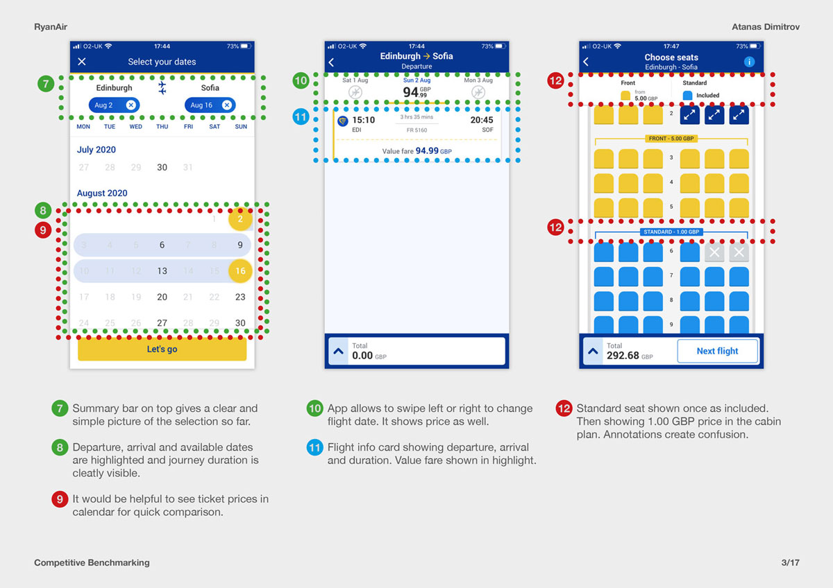
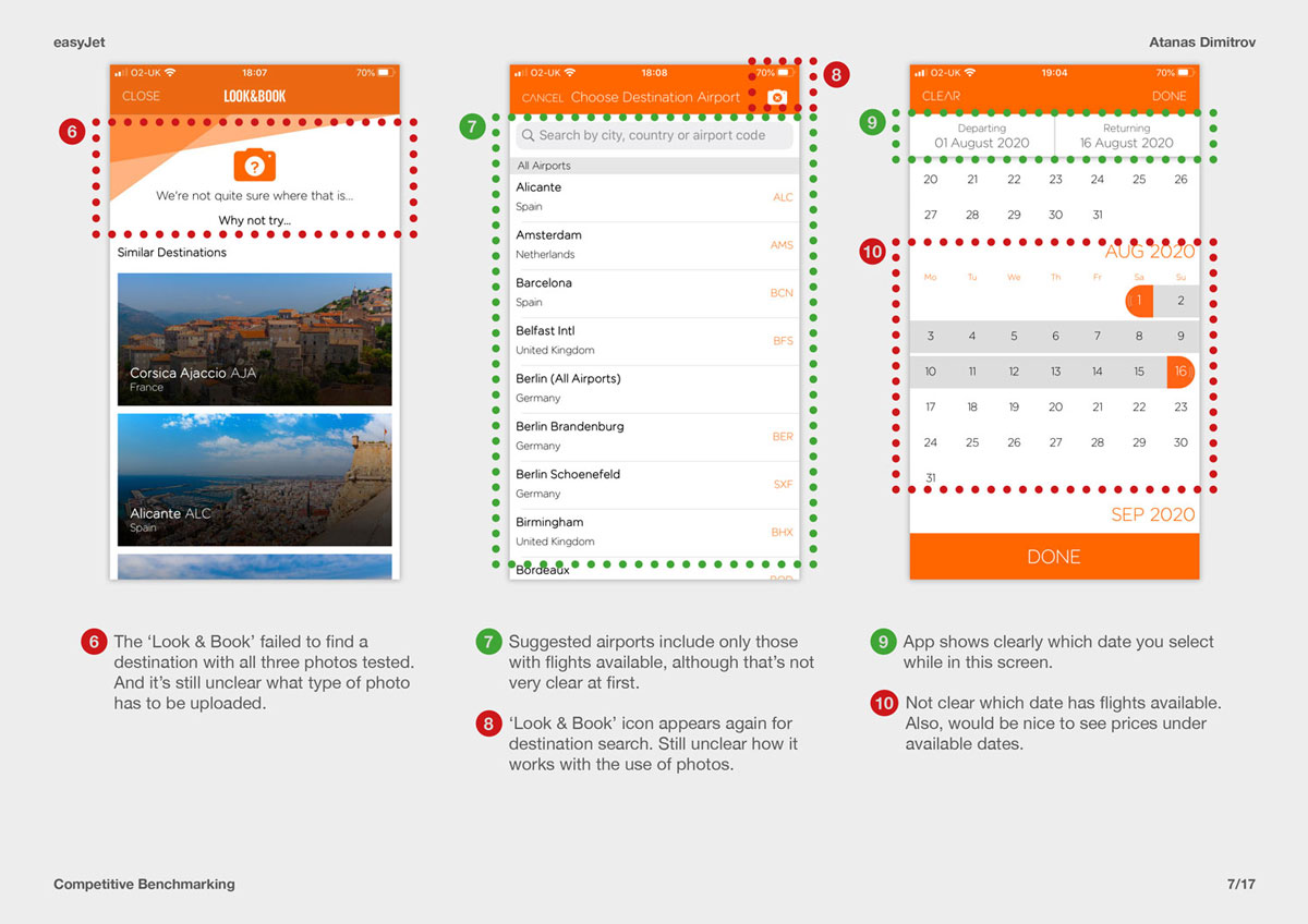
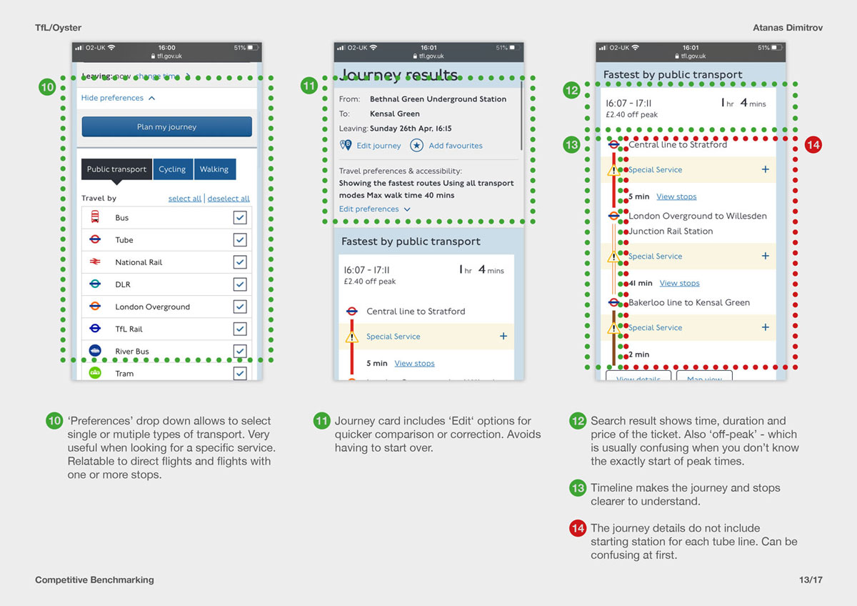
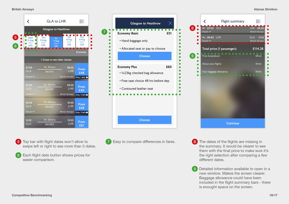
Competitive Benchmarking
The project was initiated with competitive benchmarking task on four flight booking apps to gain a better understanding of the flight booking process and spot potential pain points. I have also highlighted elements and features that had a positive impact throughout the process in order to compare good design practices common across most apps.
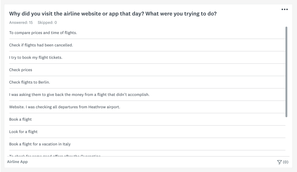
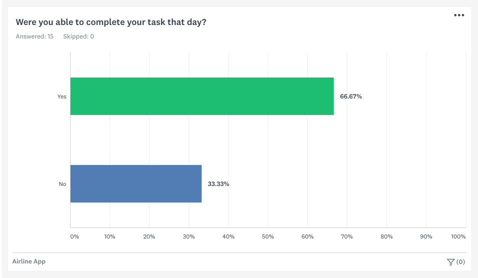
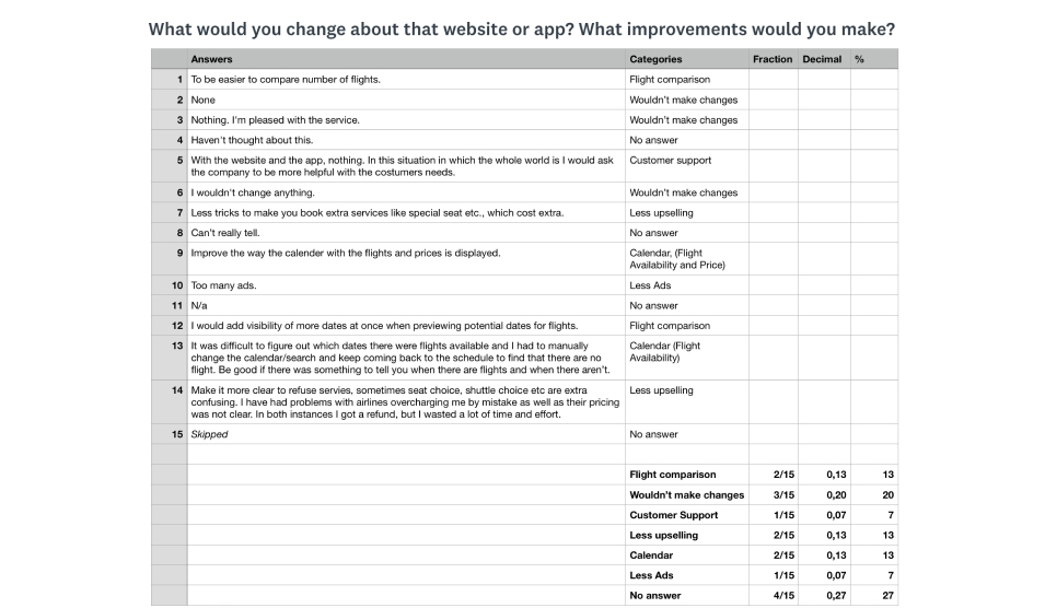
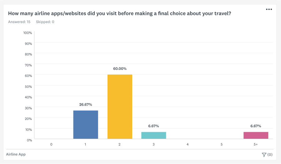
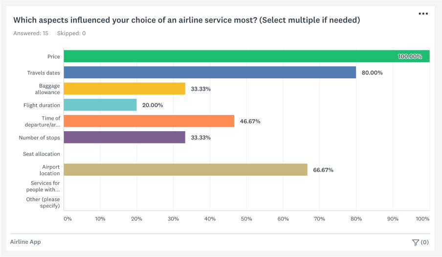
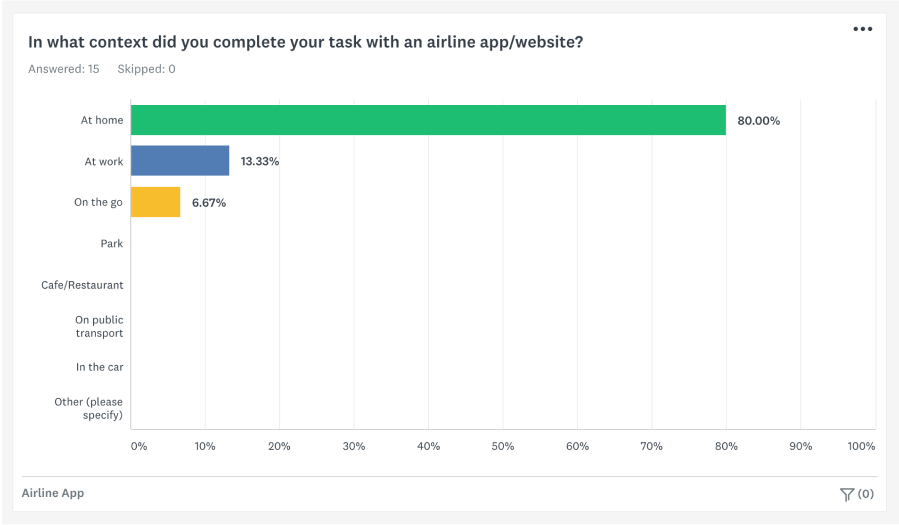
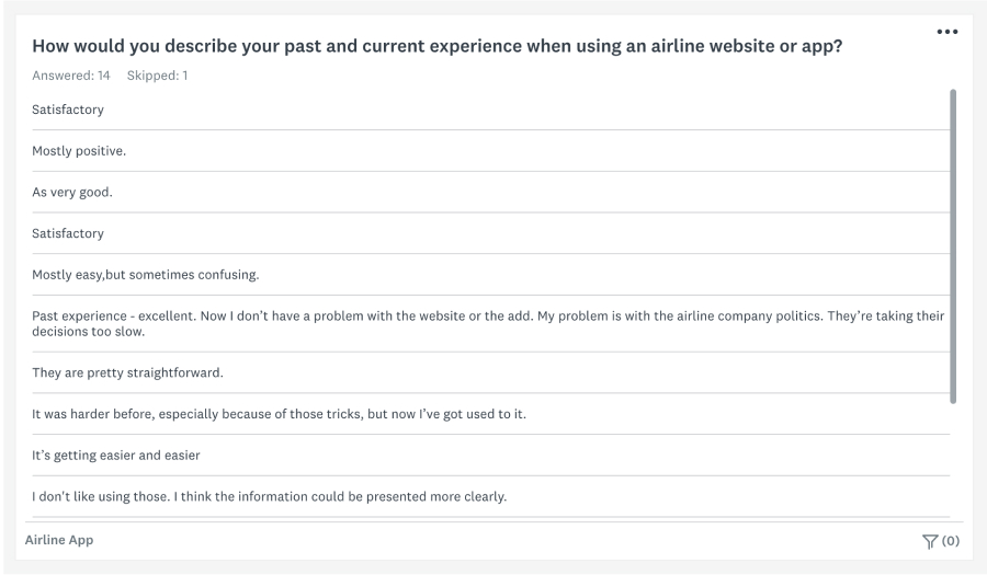
Online Survey
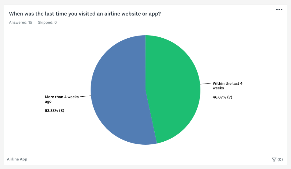
To make more informed design decisions I created a short 10 question online survey, which helped me learn more about the expectations of airline customers and whether anything is preventing them from achieving their goals. The results were mainly qualitative, with some open questions to collect more detailed answers. Due to the educational nature of the project, the survey targeted a small number of people, comparing to real life projects where the goal would be at least 400 participants.
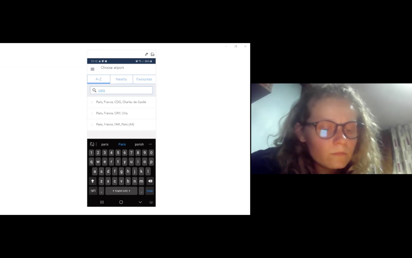
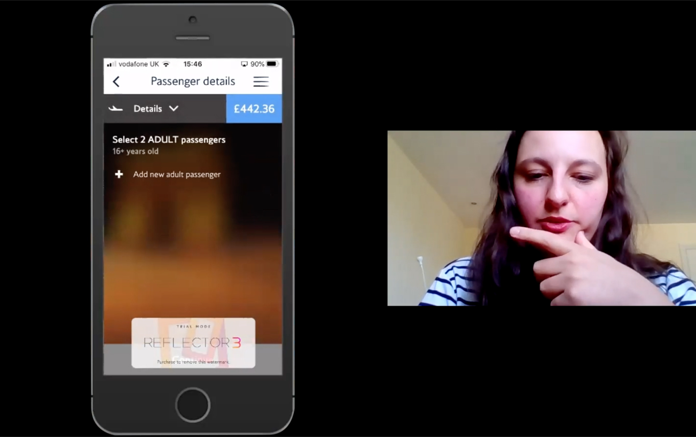
Usability Testing and Depth Interviews
The main focus in the research phase was usability testing with users (two sessions completed with WizzAir and British Airways mobile apps). The interview + test sessions continued for about an hour following an interview script to make sure the focus stays on the user’s honest, unbiased feedback and avoid leading questions. The sessions were carried out online due to restrictions and included recruitment screener & consent for the material to be recorded. My goal was to gain better insight into the user mental models, behaviour while using the apps, and the pain points leading to repetitives mini-tasks during the booking of flight tickets. The main objectives were defined as:
- Identify interruptions in the booking process.
- What are the reasons to start over/return to previous screens?
- Where did interruptions occur?
Define
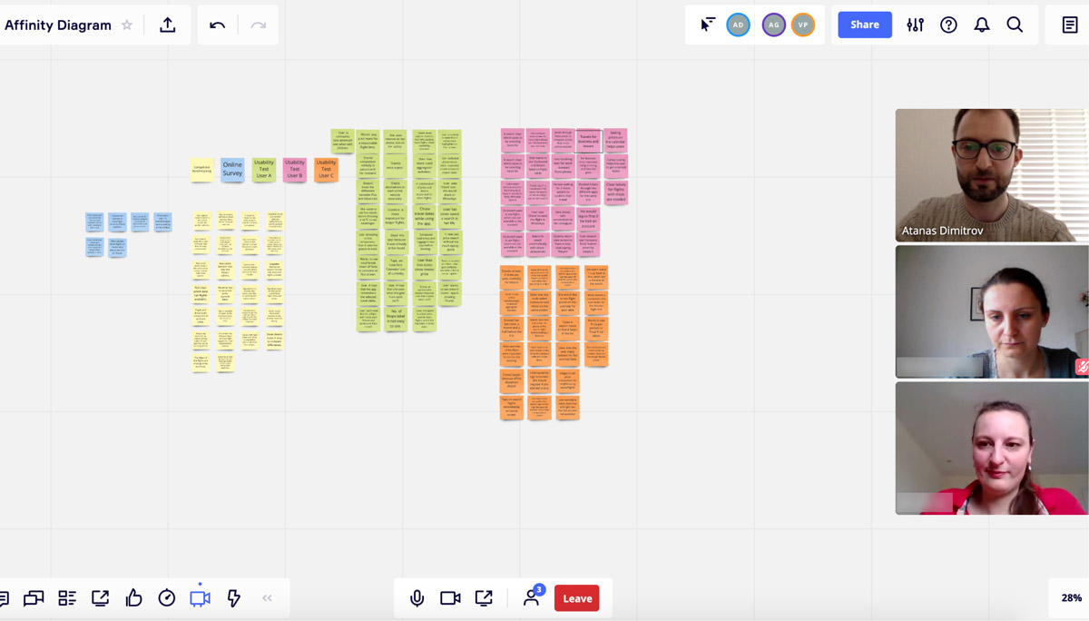
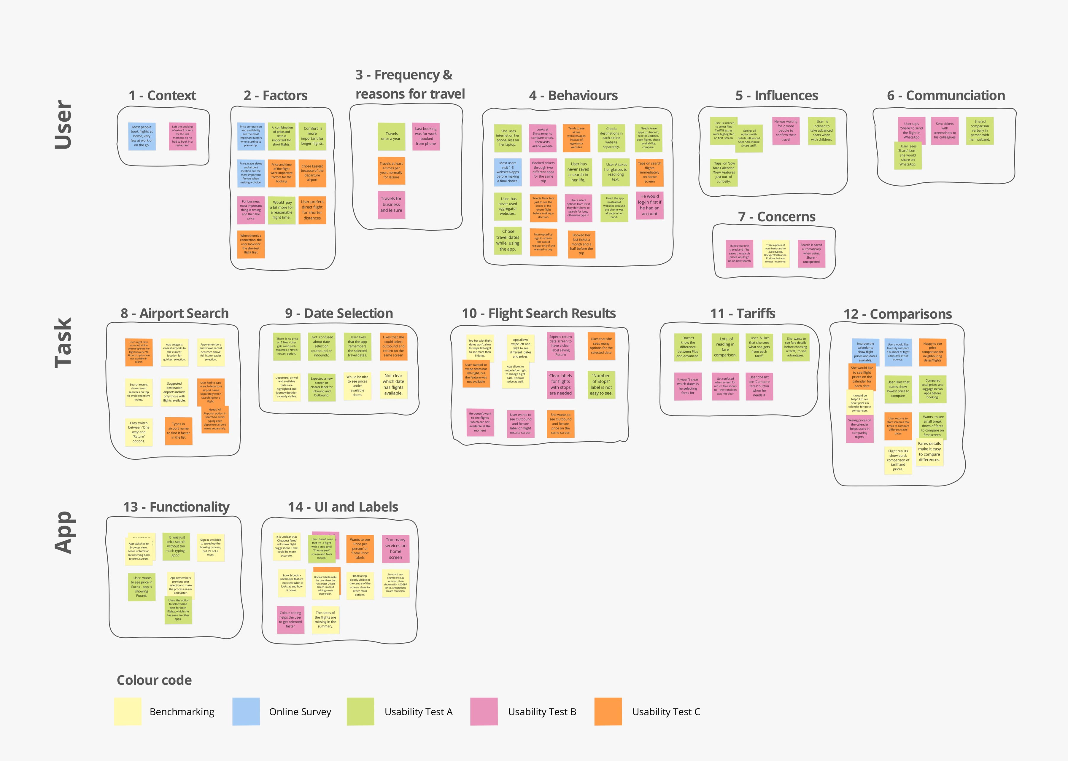
Affinity Diagram
At this stage I’ve received help with the analysis of the research data in order to give it a clearer structure for the following design tasks. Prior to the start of the affinity diagram session, I’ve shared all of the research gathered so that each of the participants could summarise notes to put on a whiteboard. The affinity diagram session was conducted in Miro where we could group the findings into defined categories to give the design process a starting point in finding a solution to the more problematic areas of the flight booking process.
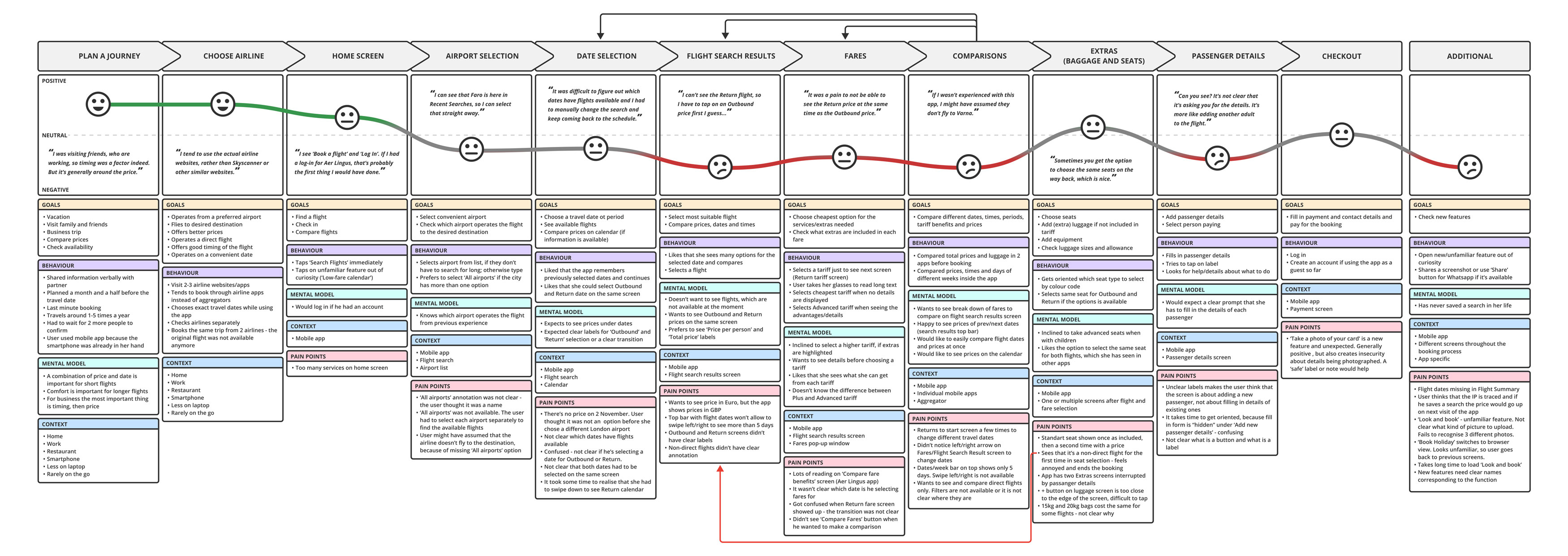
Customer Journey Map
To build on the work I did in the affinity diagram and put even more structure on the analysis of the research data, next task was to create a customer journey map. It organises the data as high-level steps of the booking process, highlighting user goals, user behaviour at each step, mental models and expectations, context, and pain points.
Design
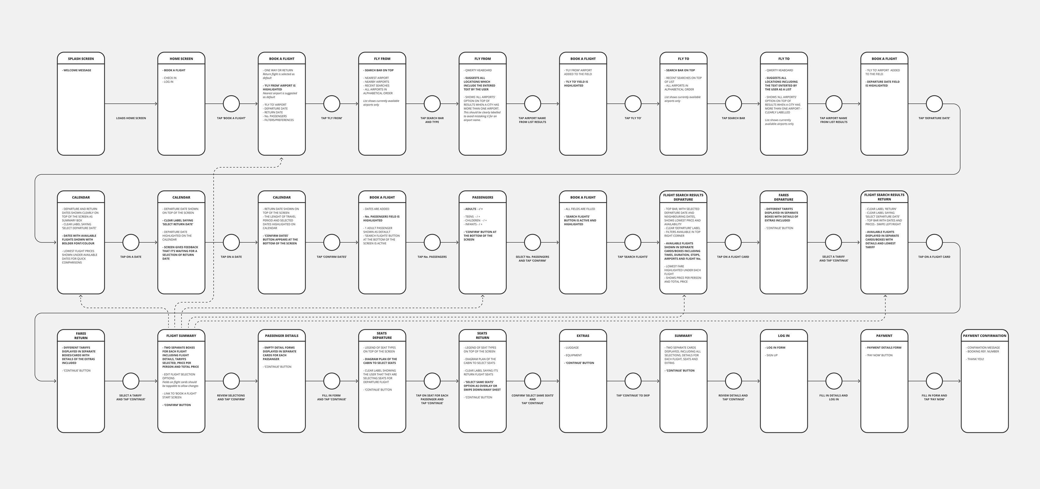
User Flow
To initialte the design of a new app, next task was to define the high-level user flow for a return journey for two passengers. The overall objective was to address the issues uncovered during the research phase, which are highlighted on the customer journey map. I’ve focused on one flow, that is, one primary use case.
Interaction Design
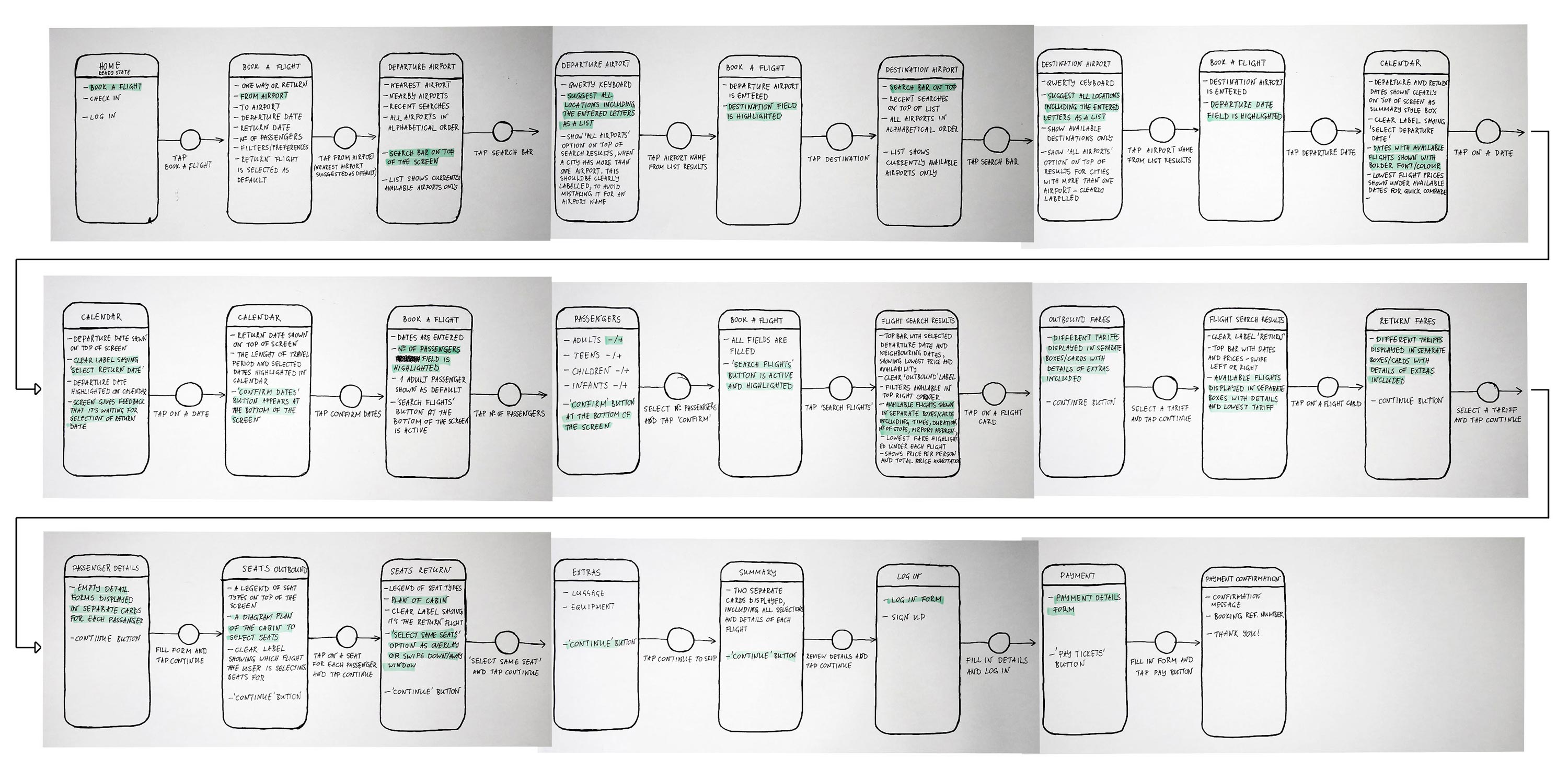
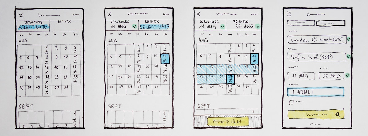
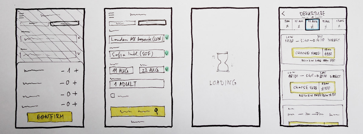
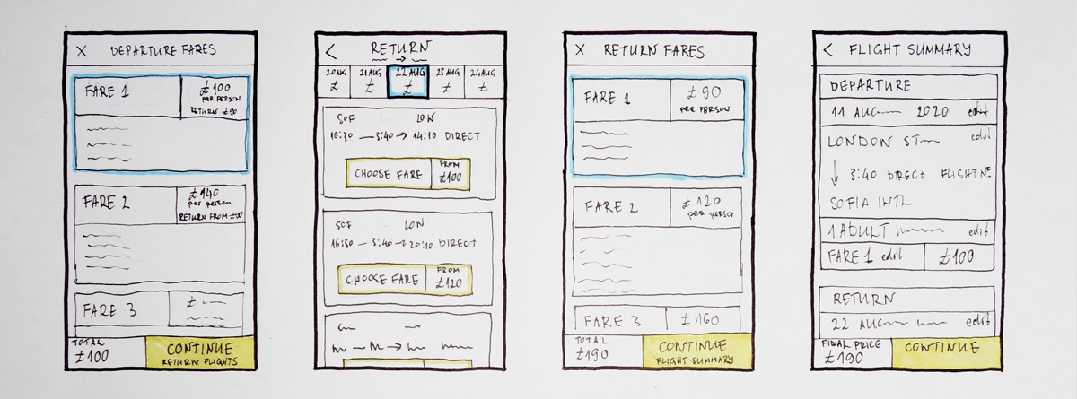
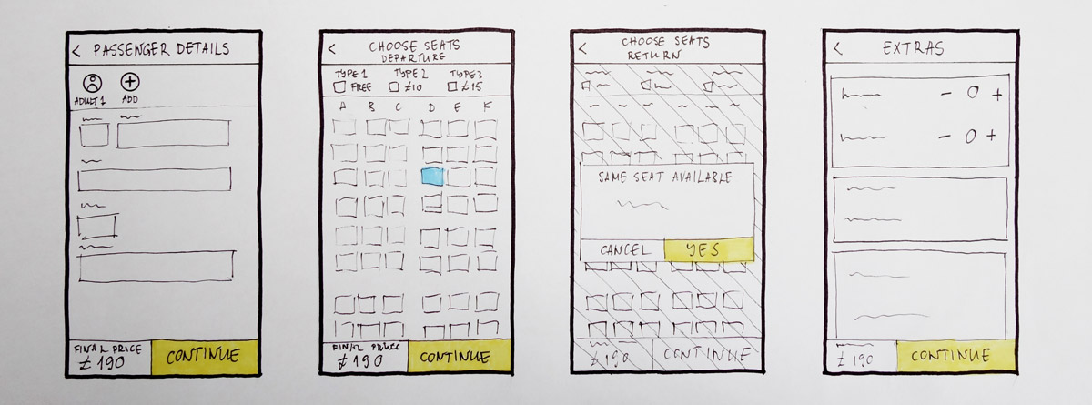
The design phase continued with sketches of the screens for the flight booking process. To build on the user flow and address the issues discovered in the research phase in more detail, the interactions design of the app looked at the most important screen states based on user actions. It was also a great way to discover inconsistencies before the actual prototyping and wireframing of the mobile app.

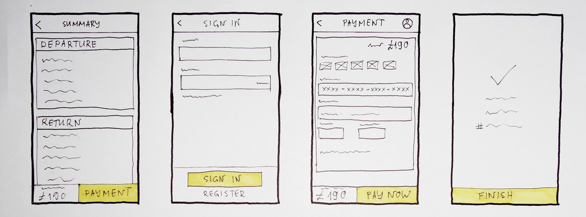
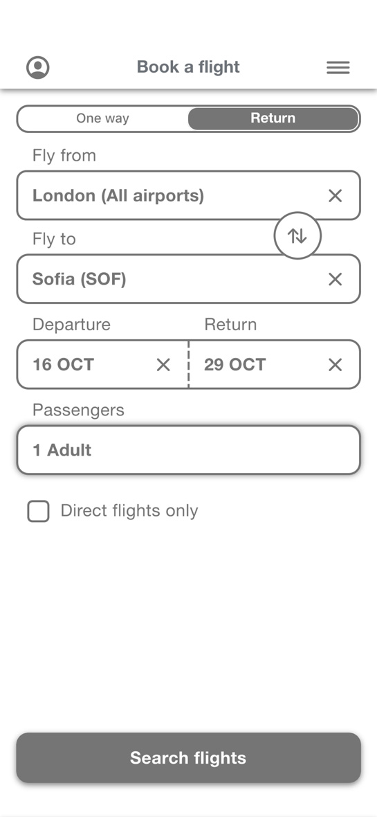
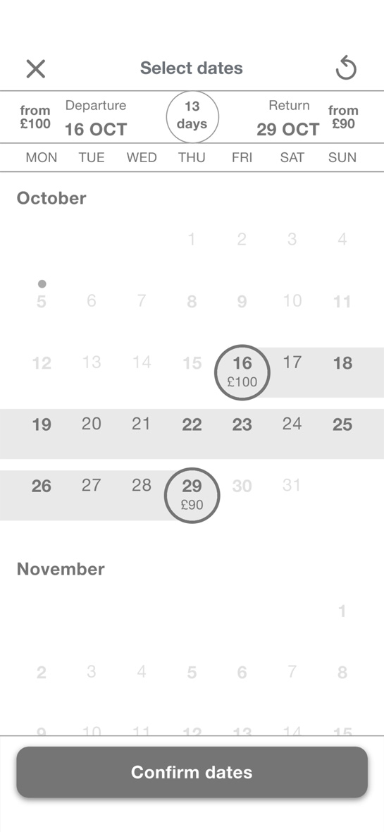
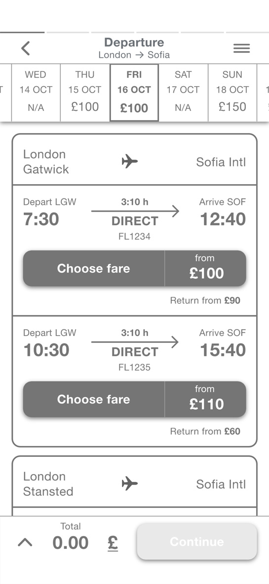
Prototypes & Wireframes
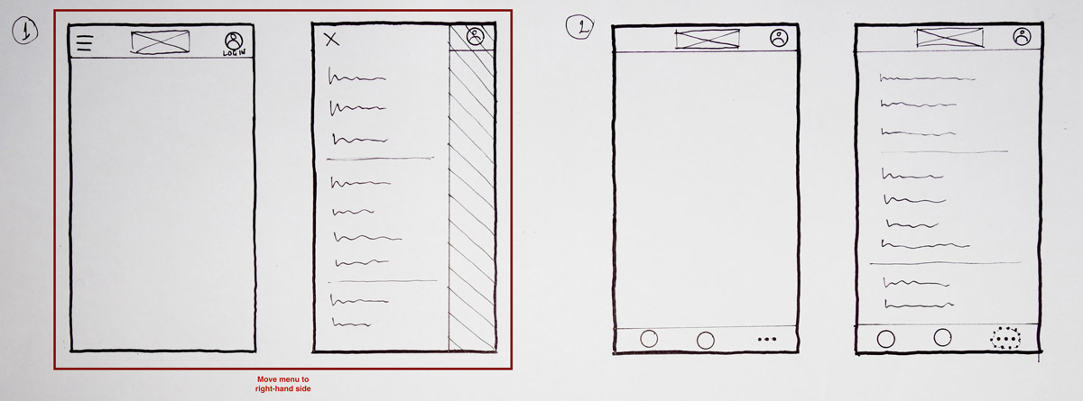
Low-fidelity Prototype
Before moving to more detailed screen design, I created a sketch ptototype to quickly run through the main interactions and see if any issues would prevent me from having a smooth experience.
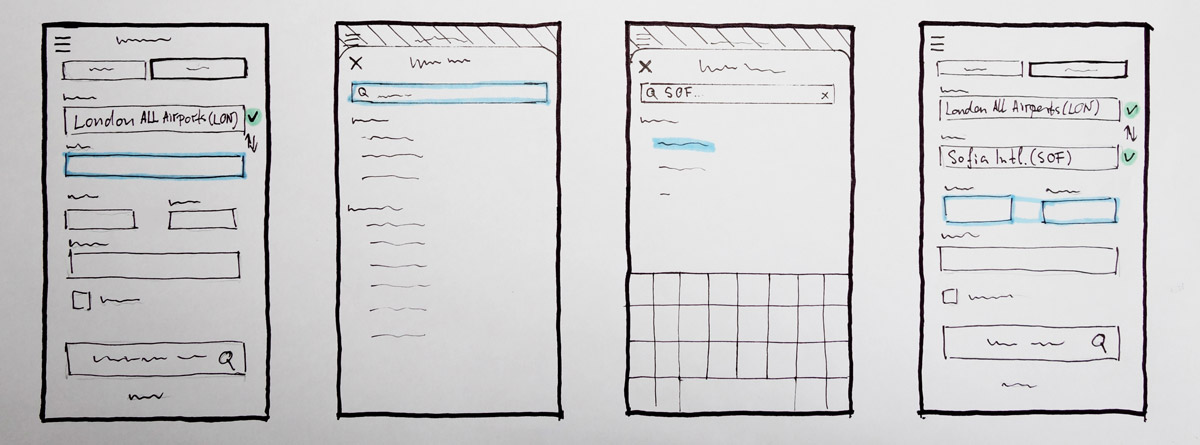
Mid-fidelity Prototype
After clarifying the base of the booking process, I created a mid-fidelity prototype to add more interactivity and prepare it for further usability testing and validation of the design.
Wireframes
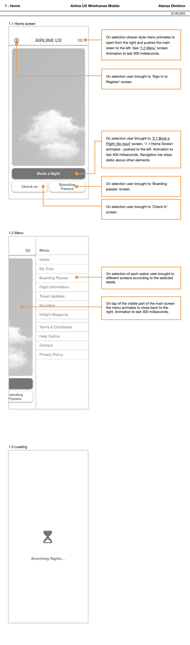
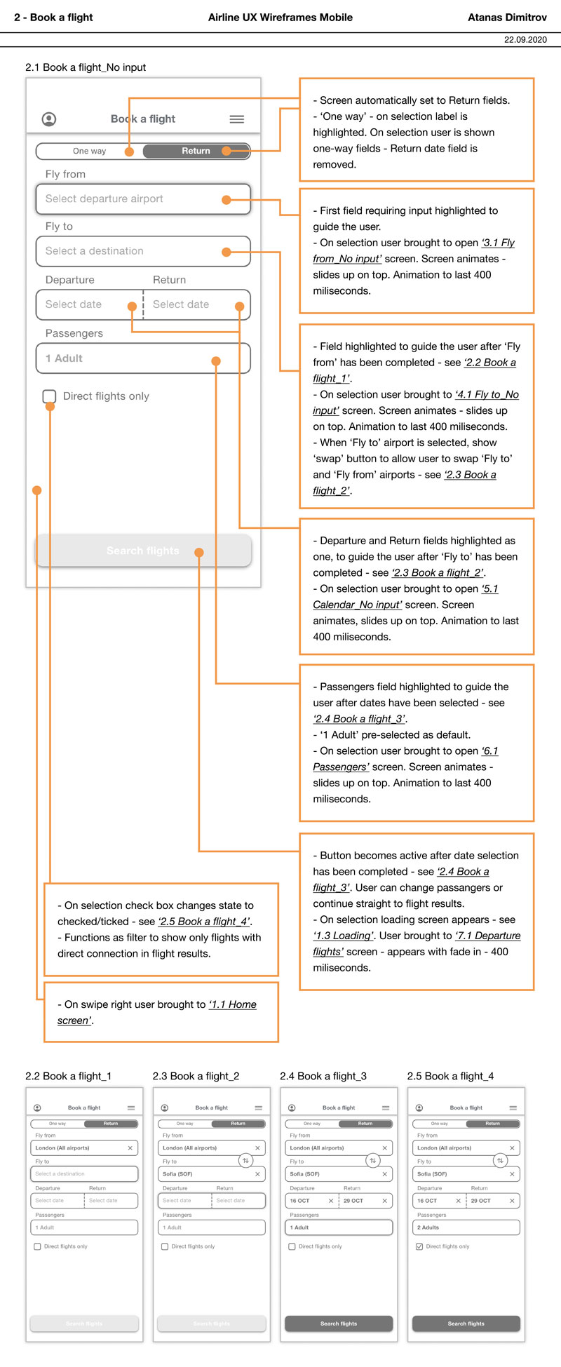
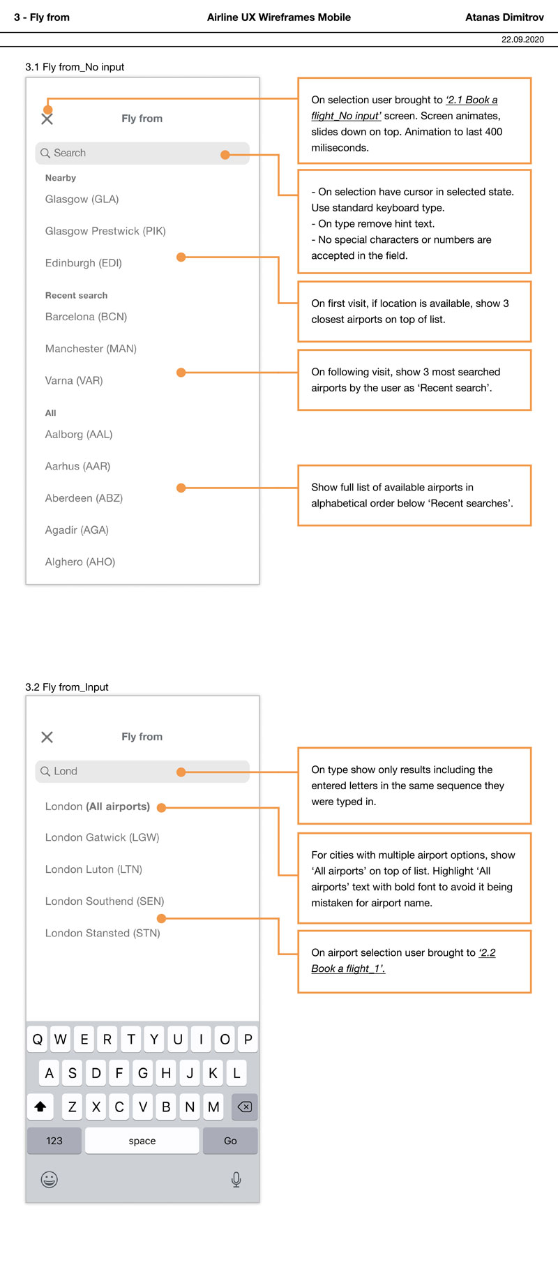
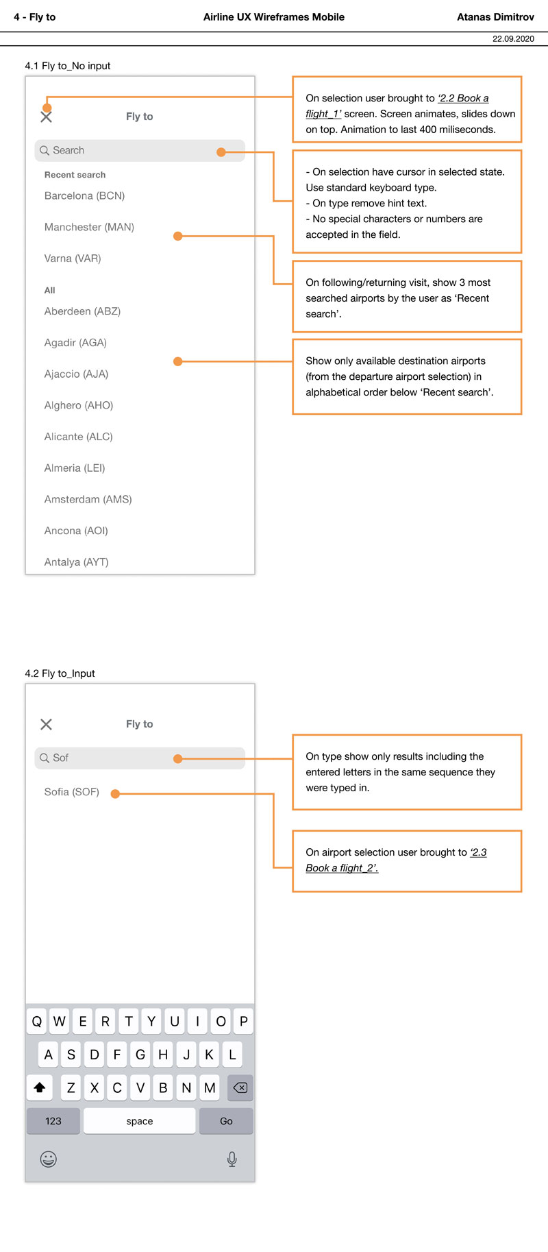
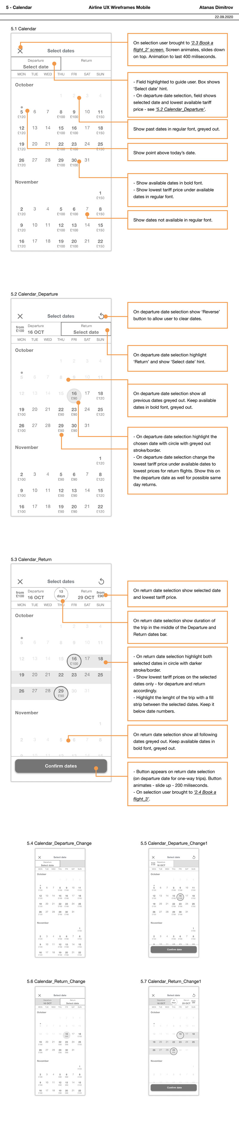
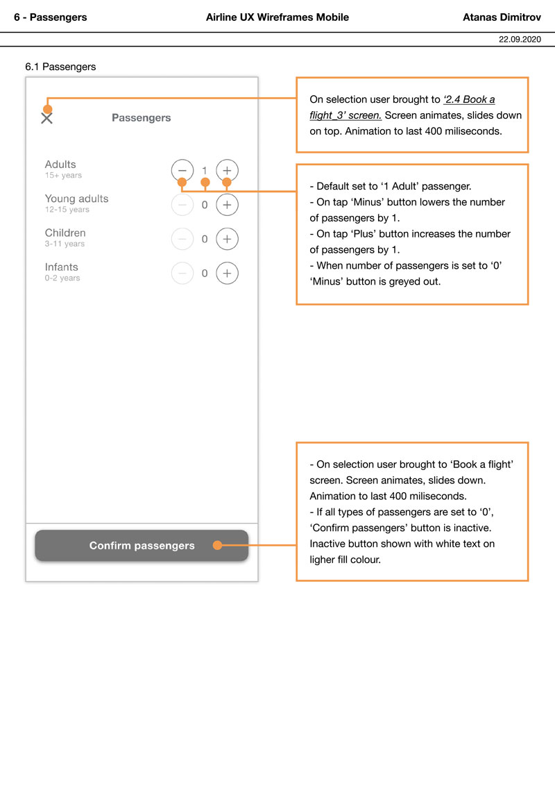
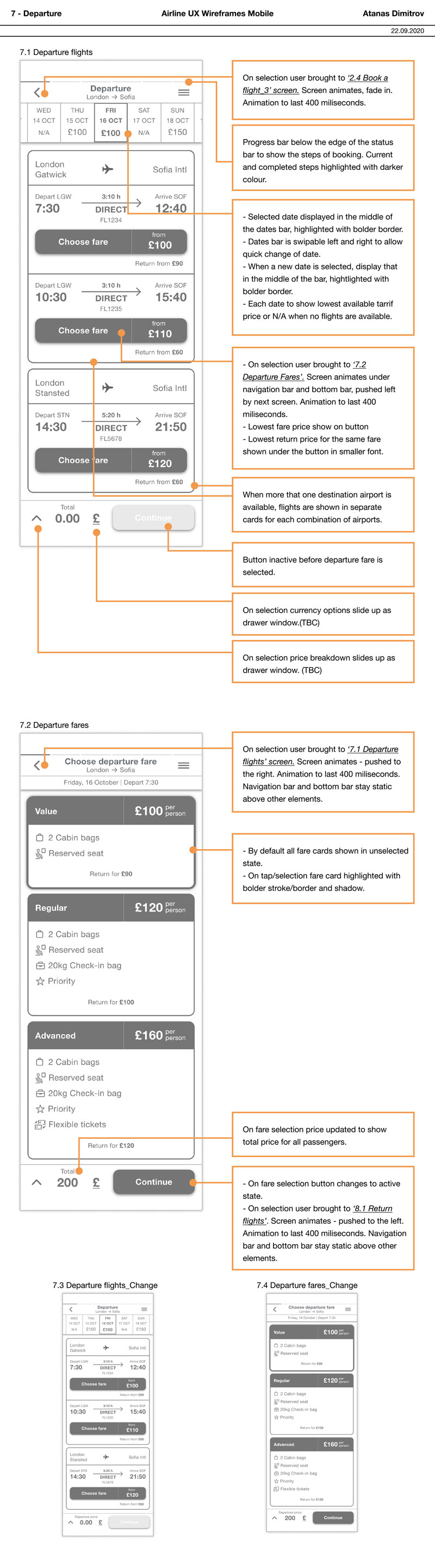
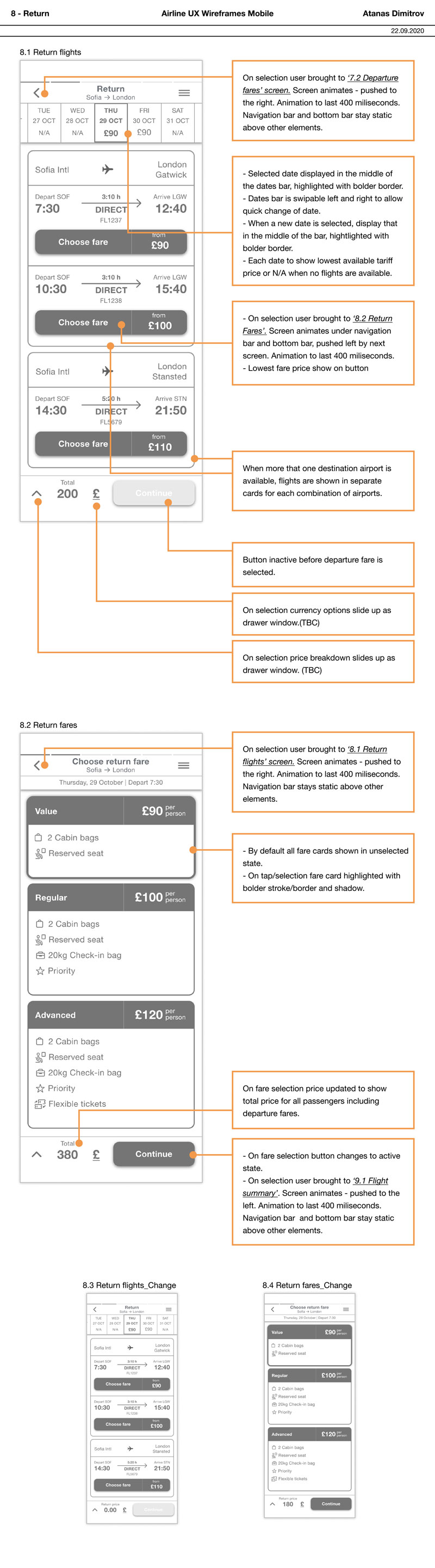
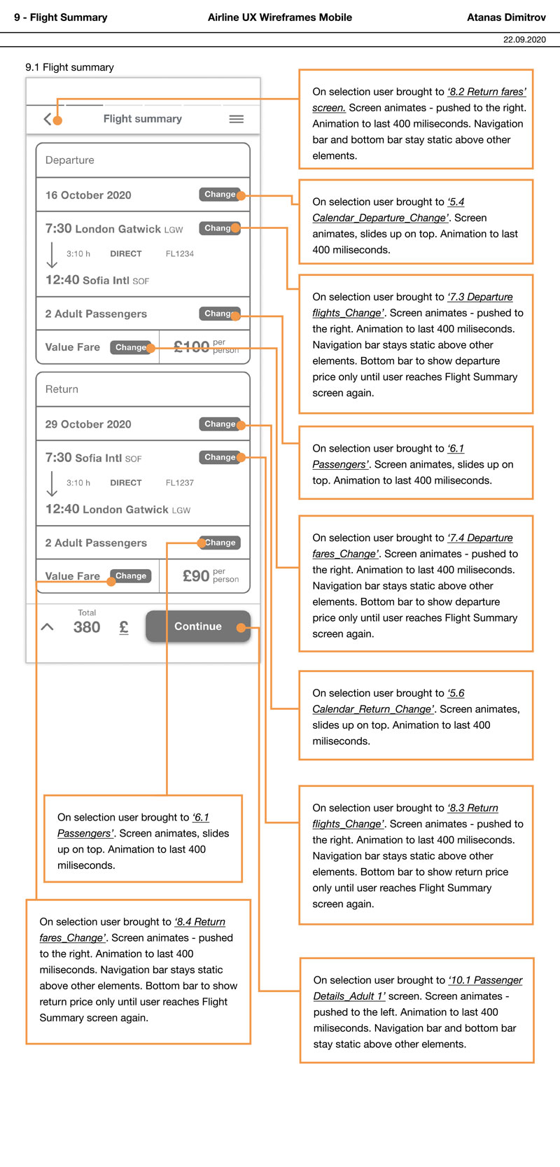
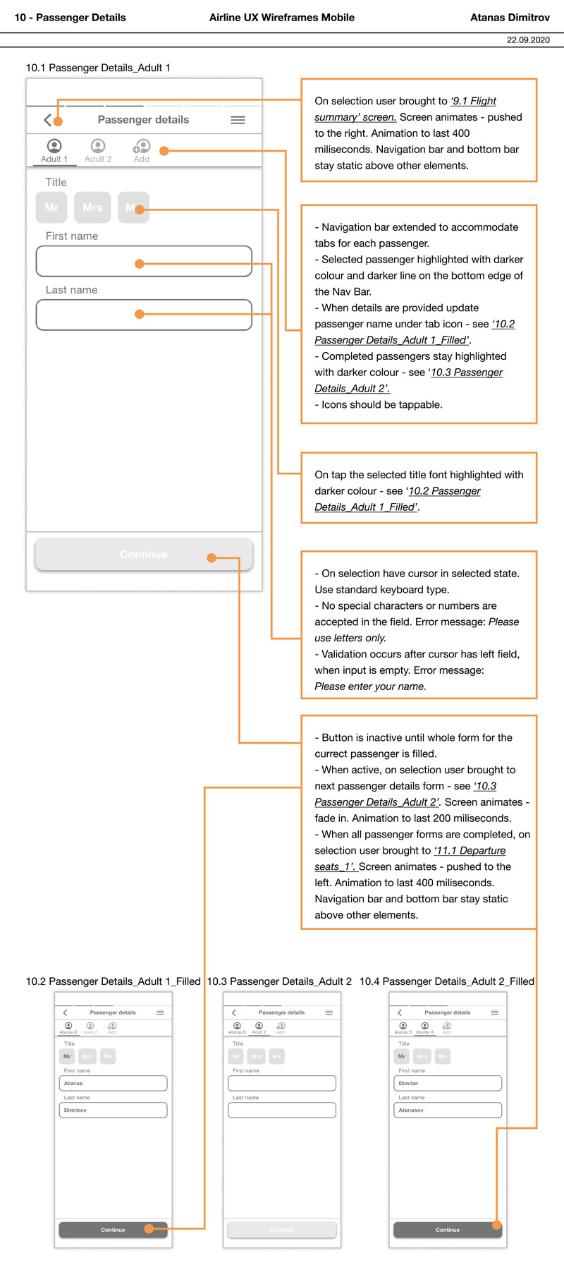
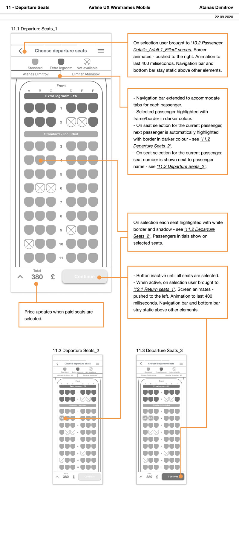
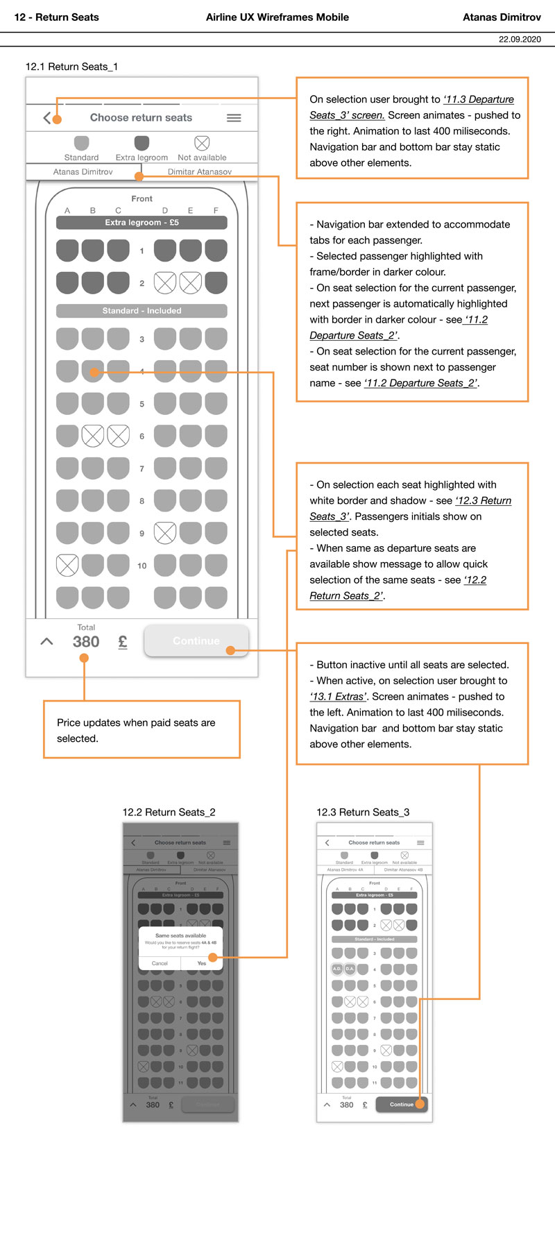
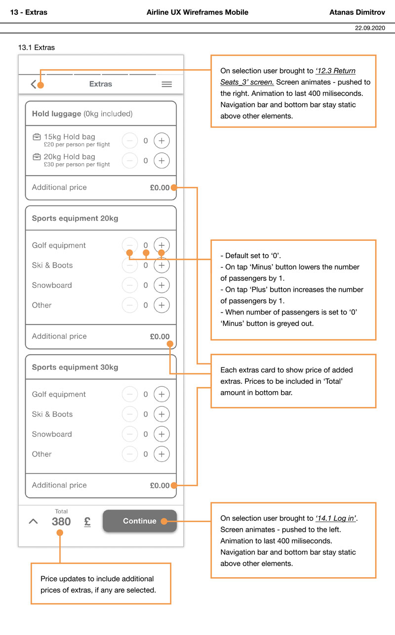
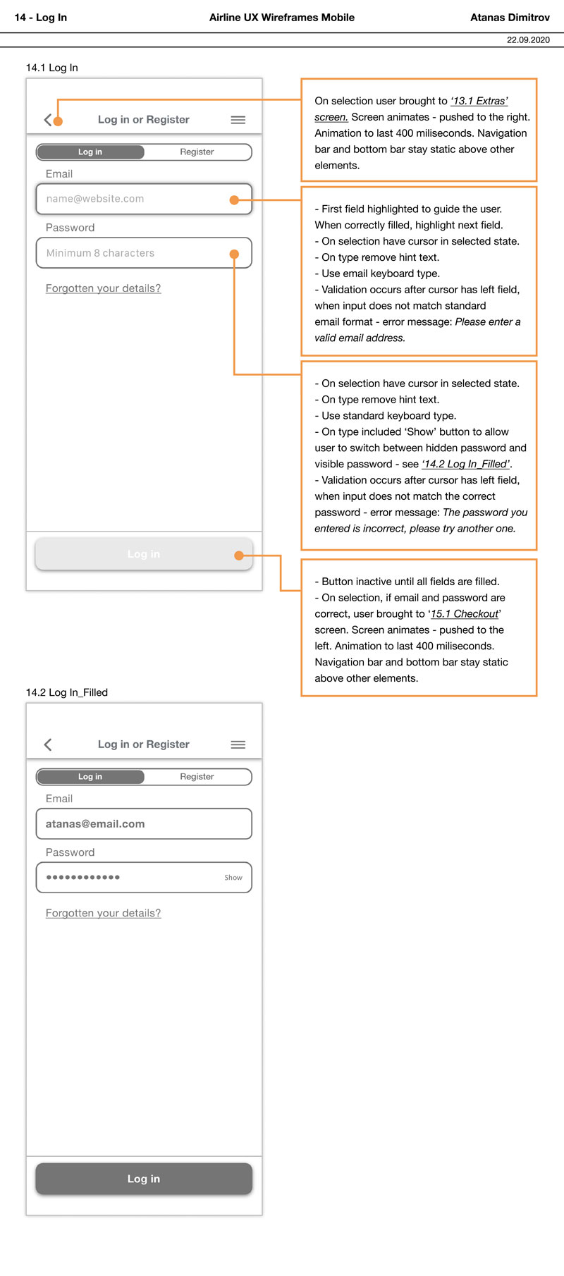
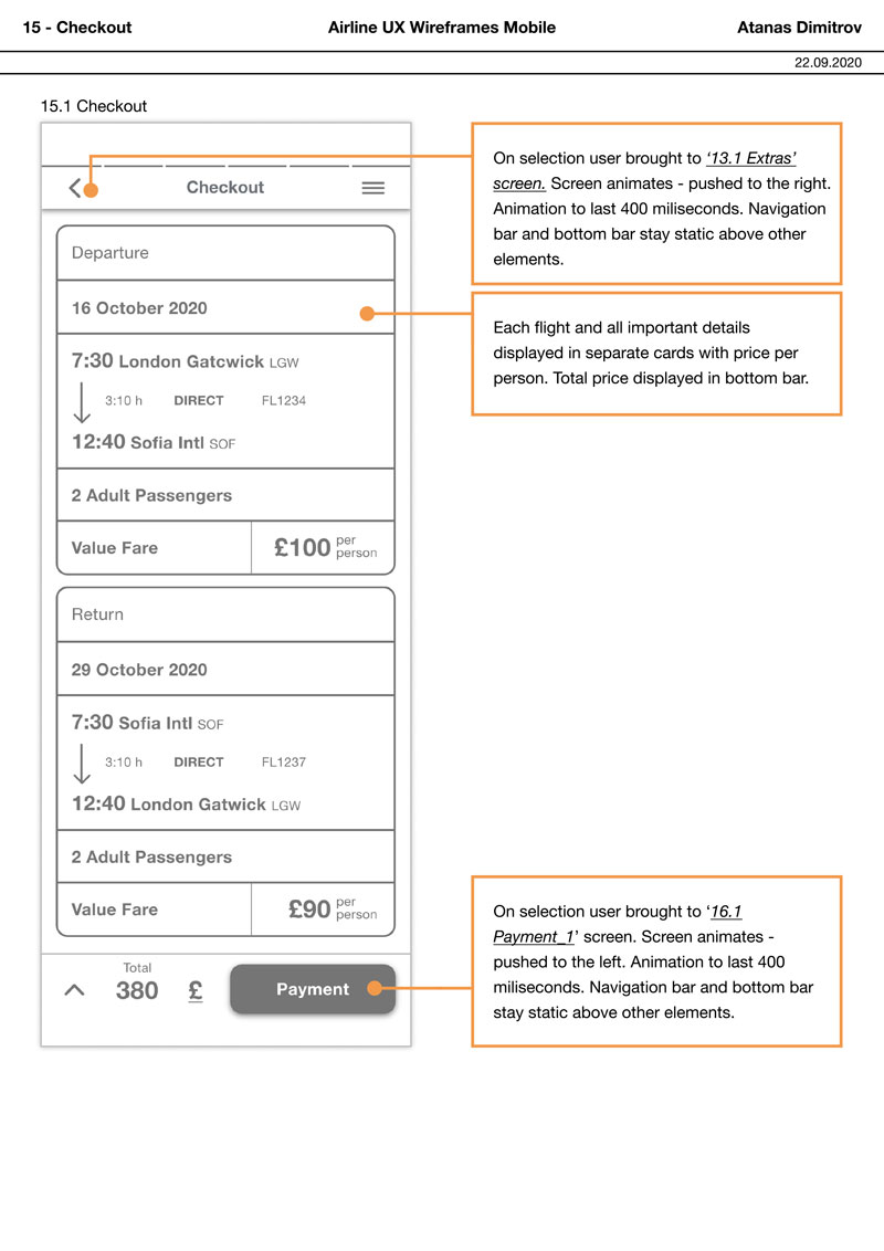
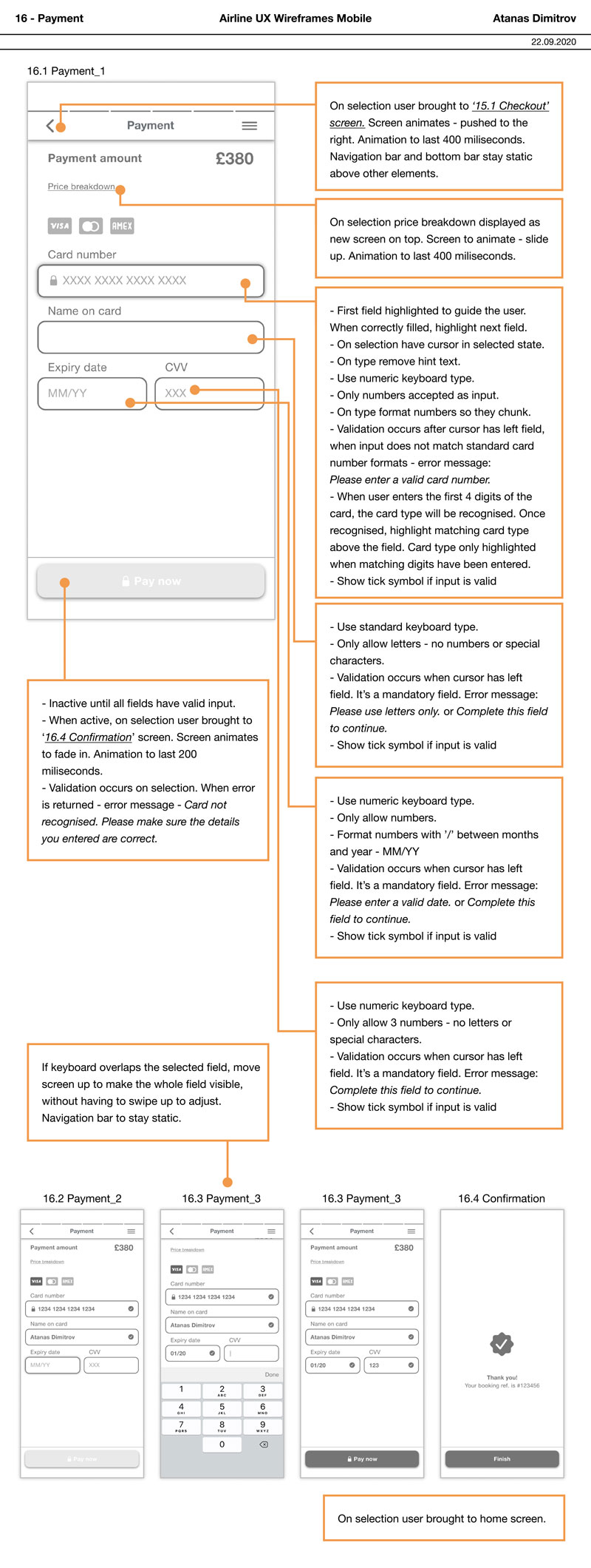
The final task was to prepare detailed wireframes which could be used by developers to build the flight booking app accurately. Each wireframe includes detailed notes on all elements of the screens and the way they should function, animate and transition during the booking process.