Mish Mash Groceries
Role
UI Design
Personal project, 2020
Survey, Sketching, User Flow, Interaction Design, Prototyping
Brief
This is a project I did before the start of UX Design and coding tutorials in order to get to know the format of mobile apps and gain a general understanding of the design principles for software applications. Due to the exercize nature of the project the main focus has been on the interface design of a groceries and shopping list app.
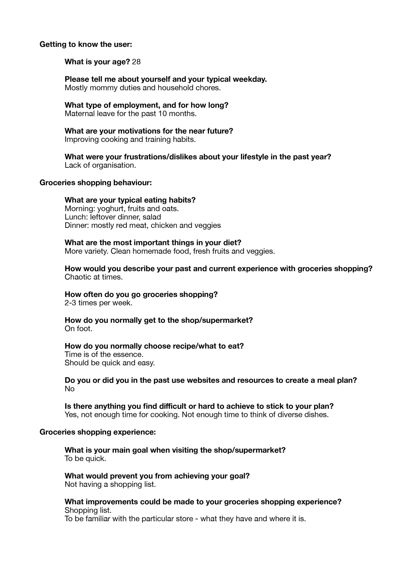
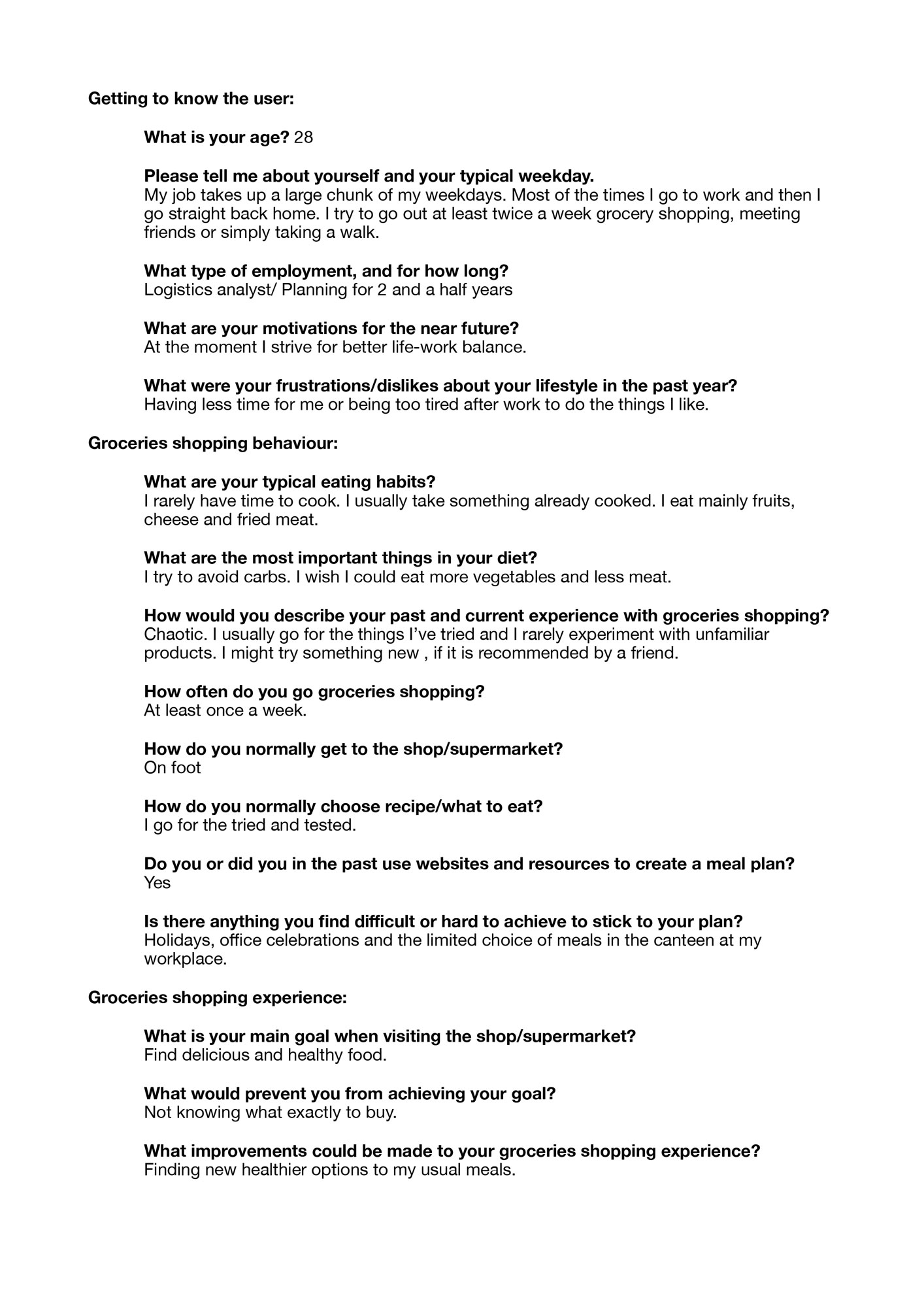
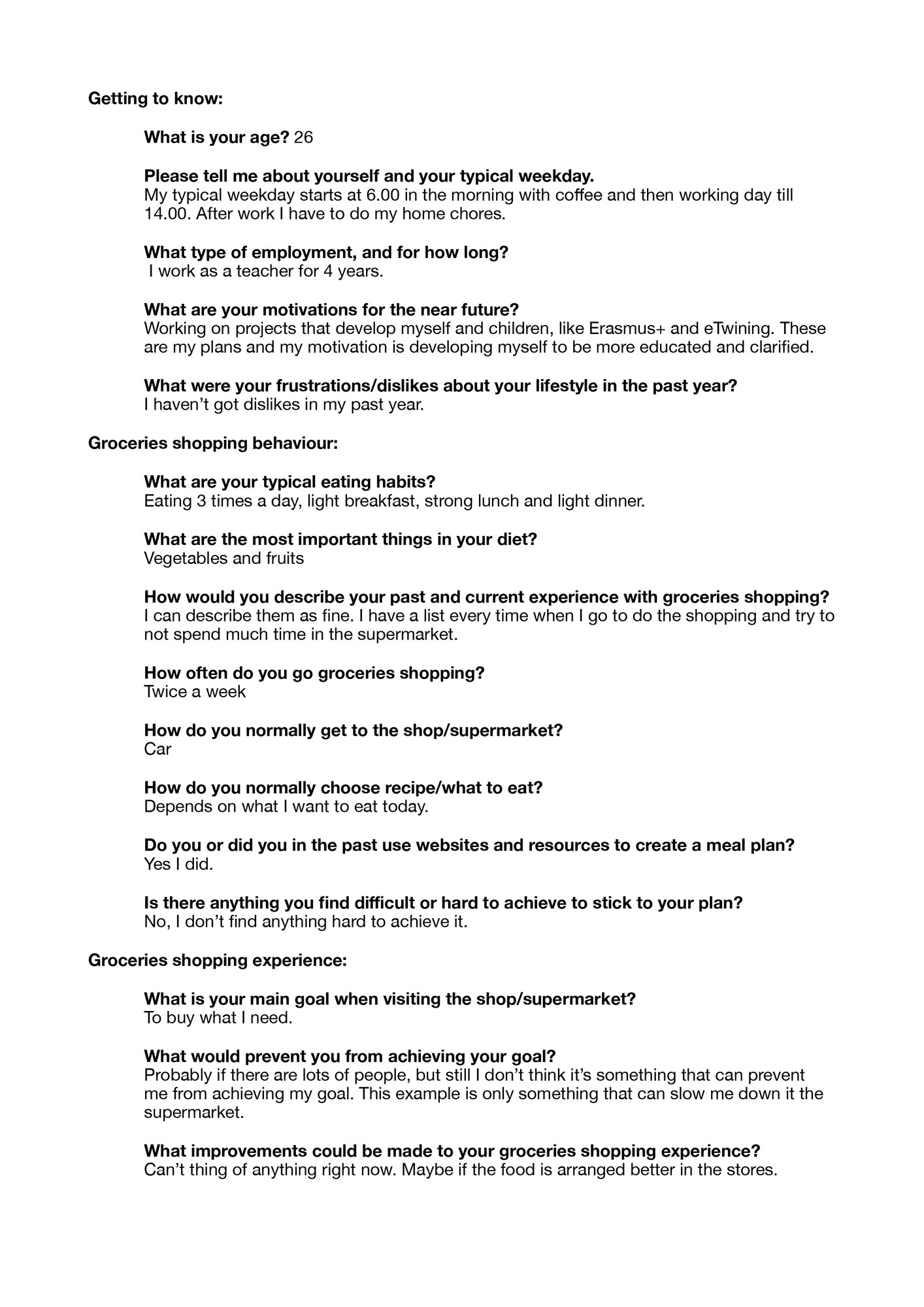
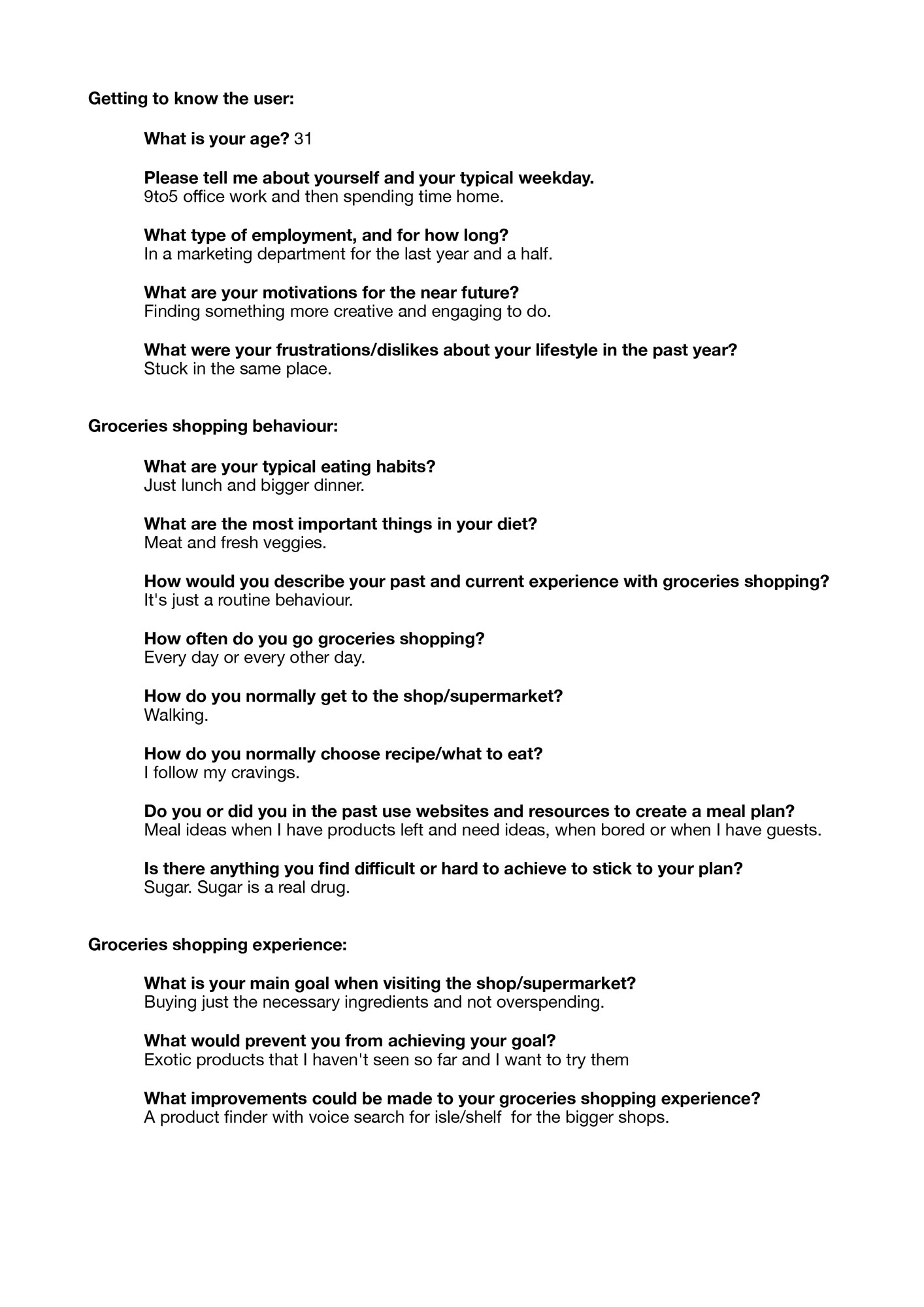
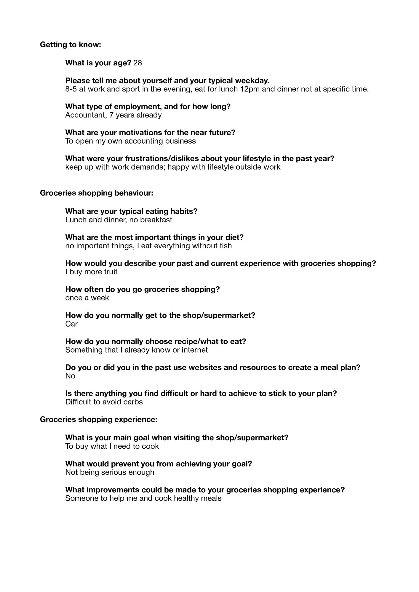
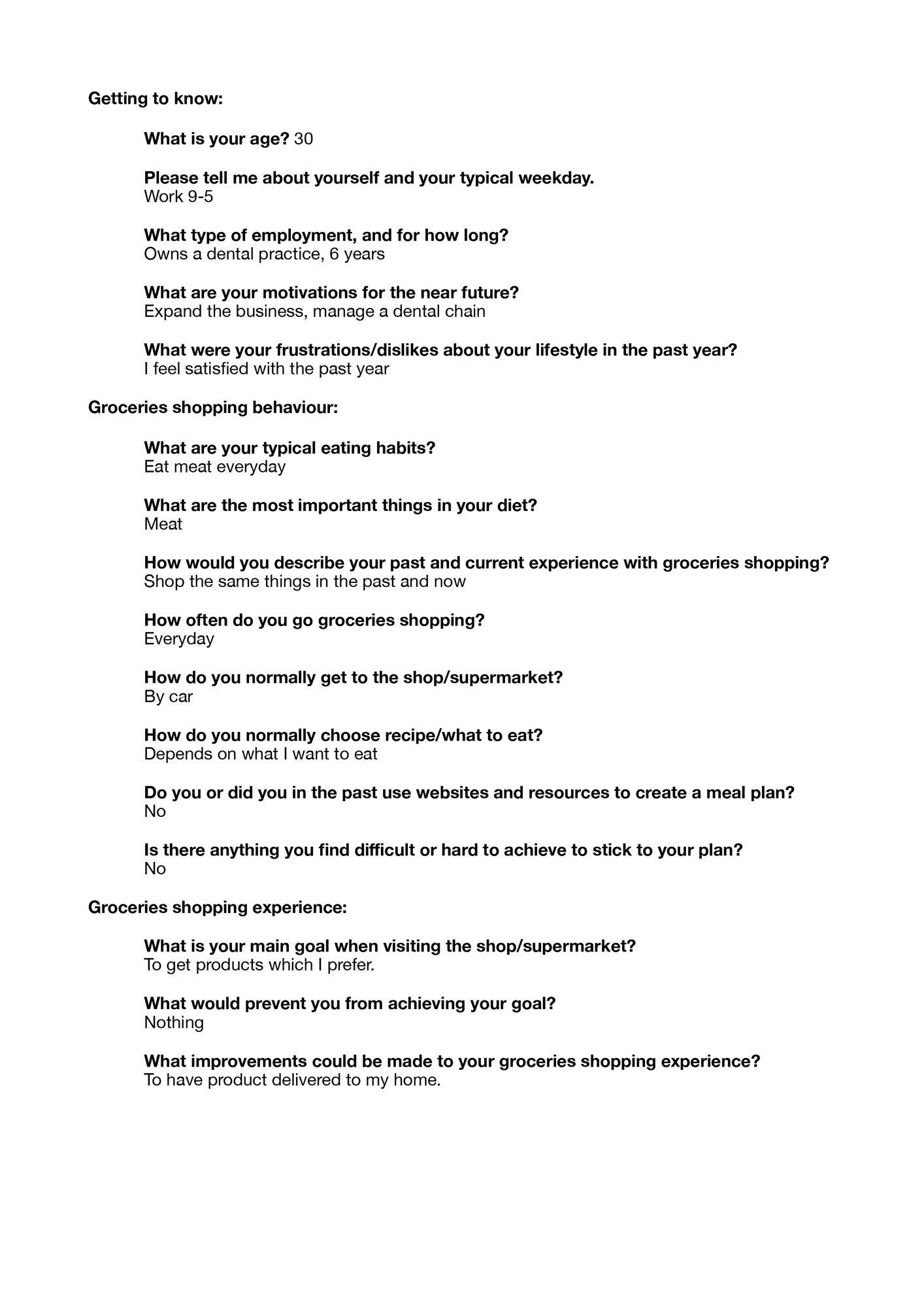
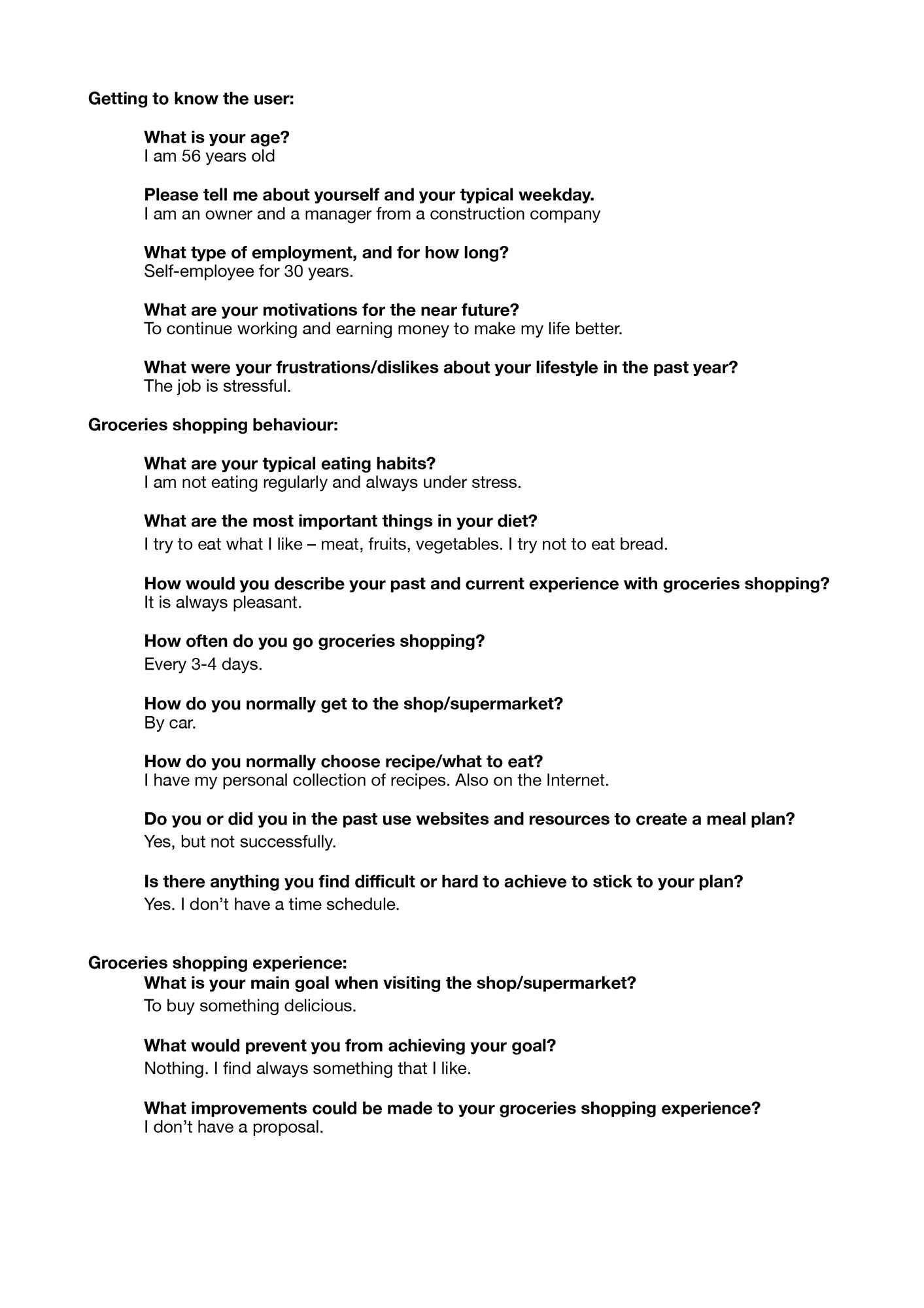
Getting to know the user
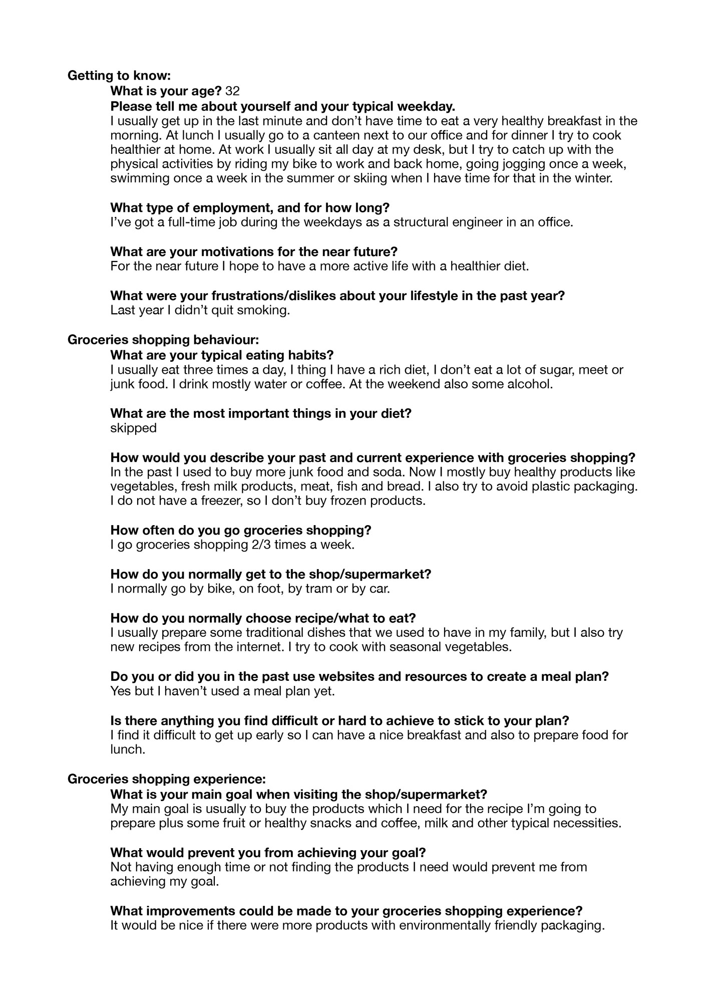
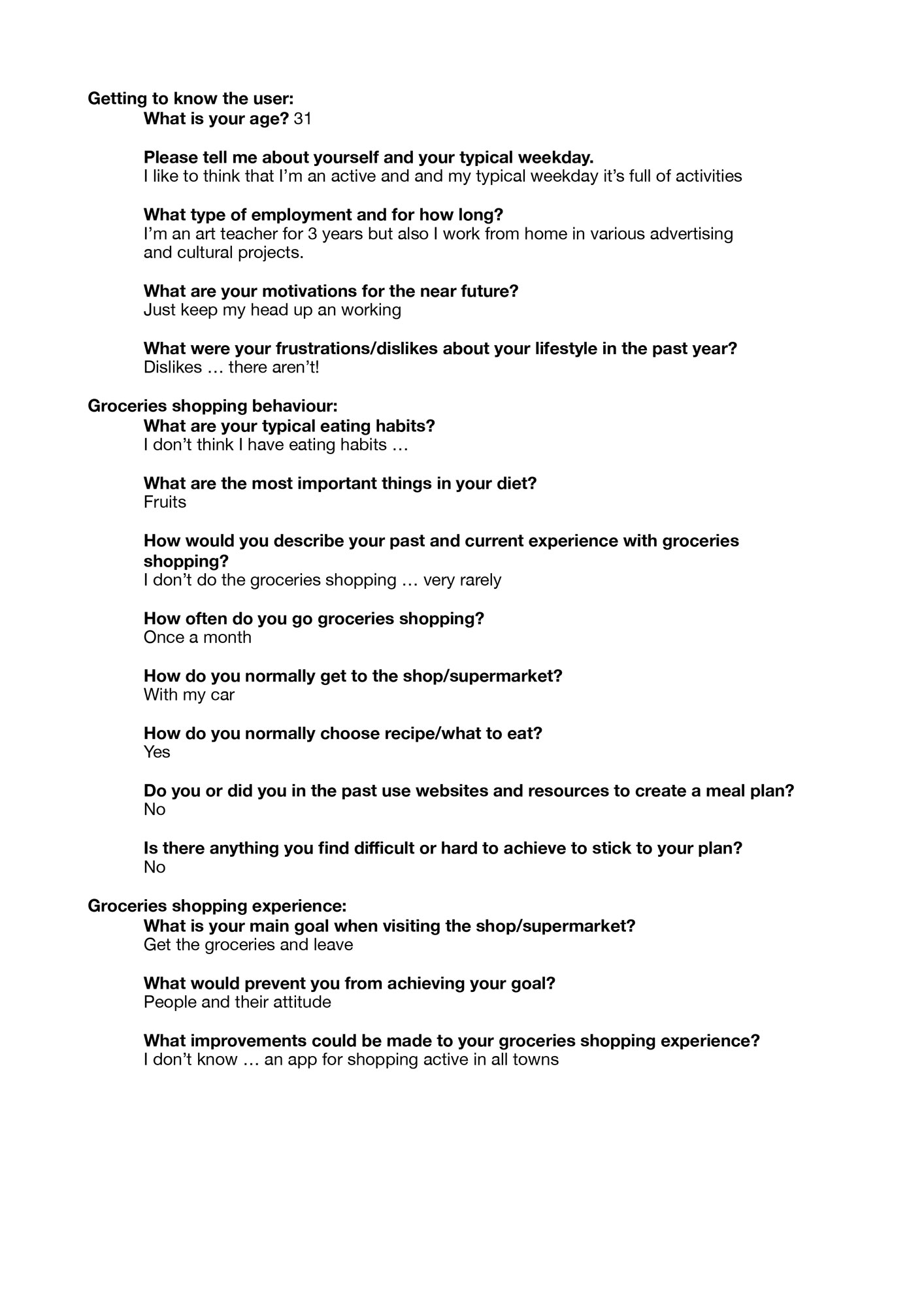
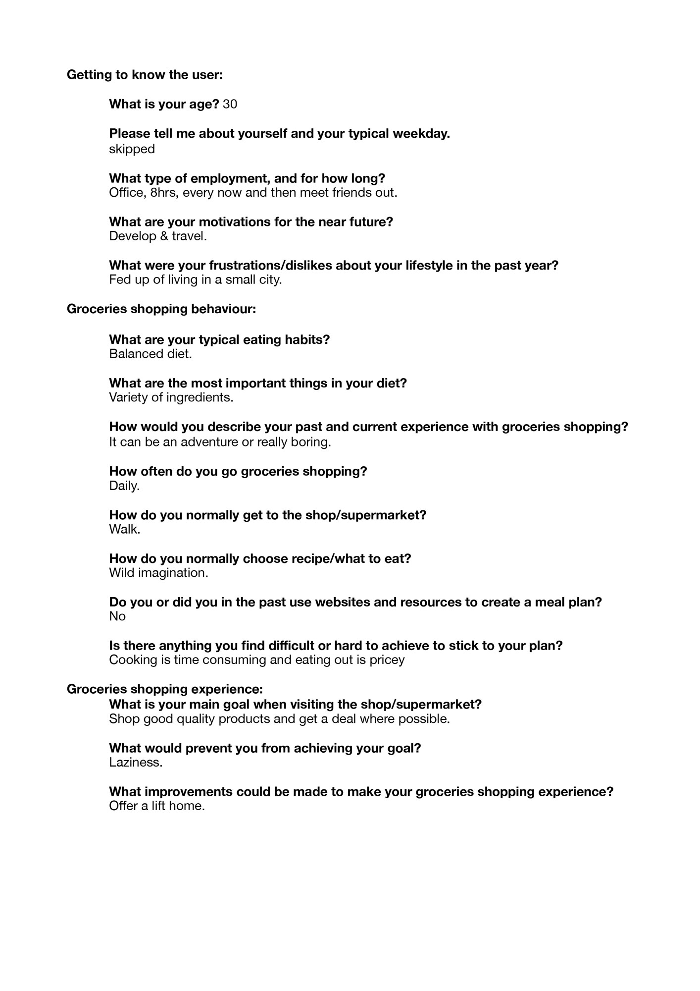
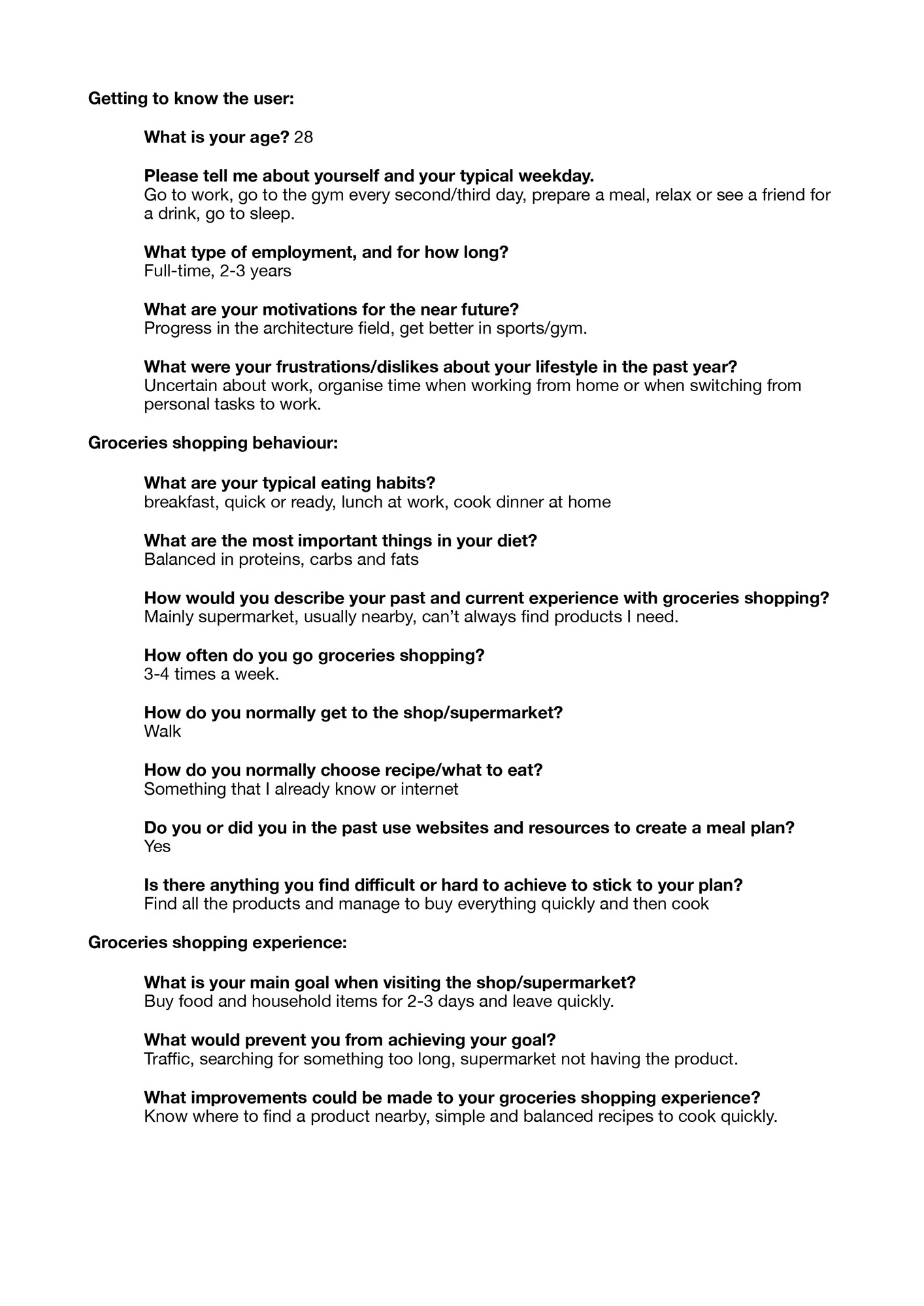
User survey
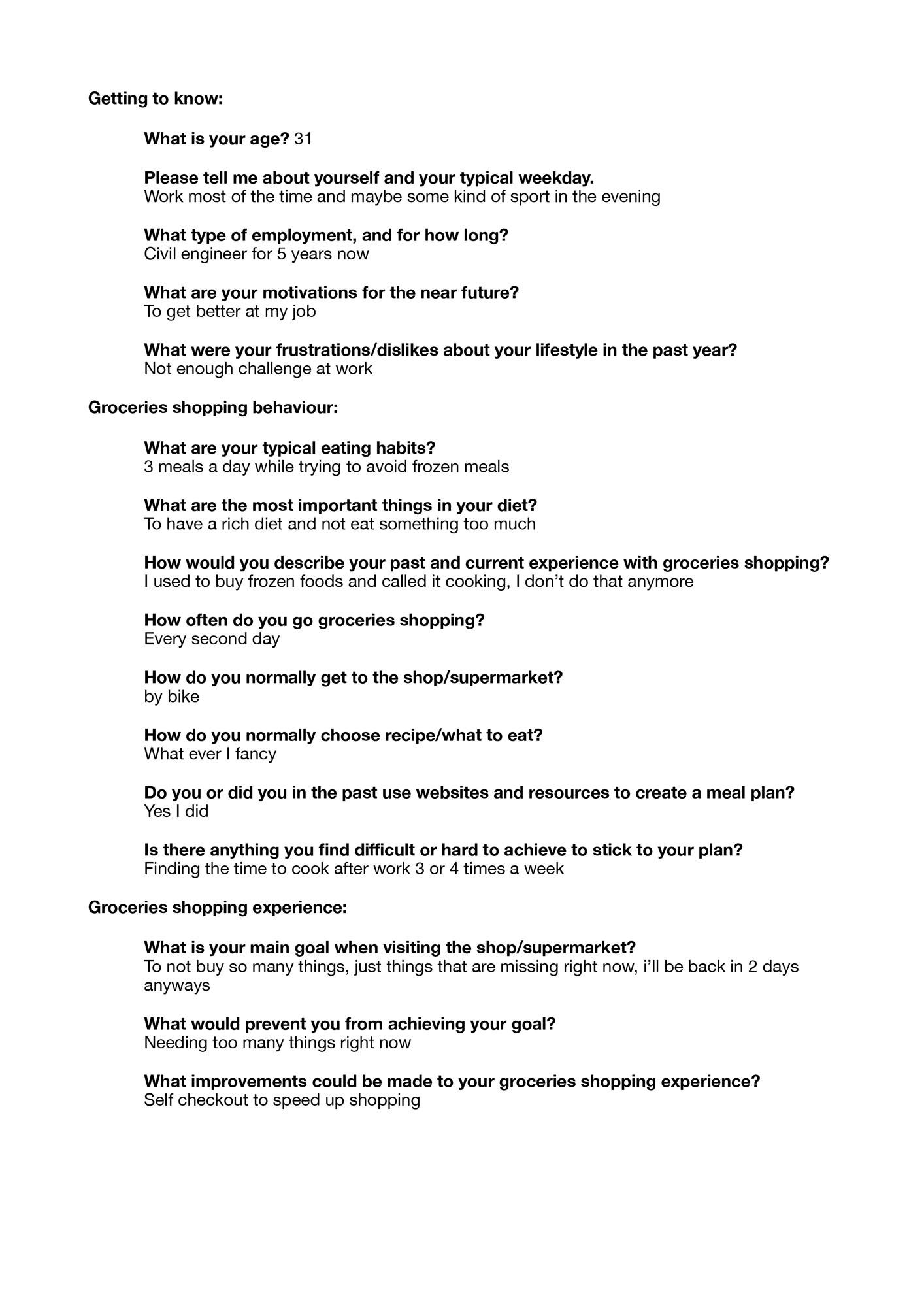
Following articles and UX Design tips on the internet, I initiated the project with a list of questions which I sent to family and friends to receive feedback on the way people feel about their shopping routines and gain a better understanding of their habits. The list of questions included three short sections focusing on:
- General information about the user.
- Their shopping behaviour and habits.
- The way the user feels about their shopping experience.
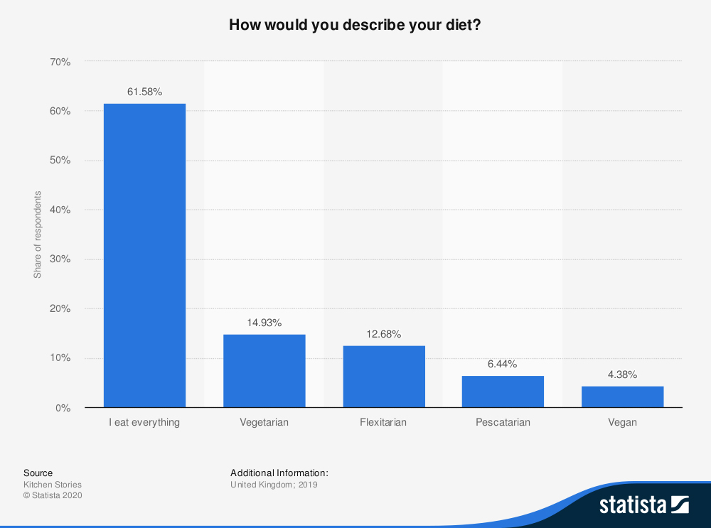
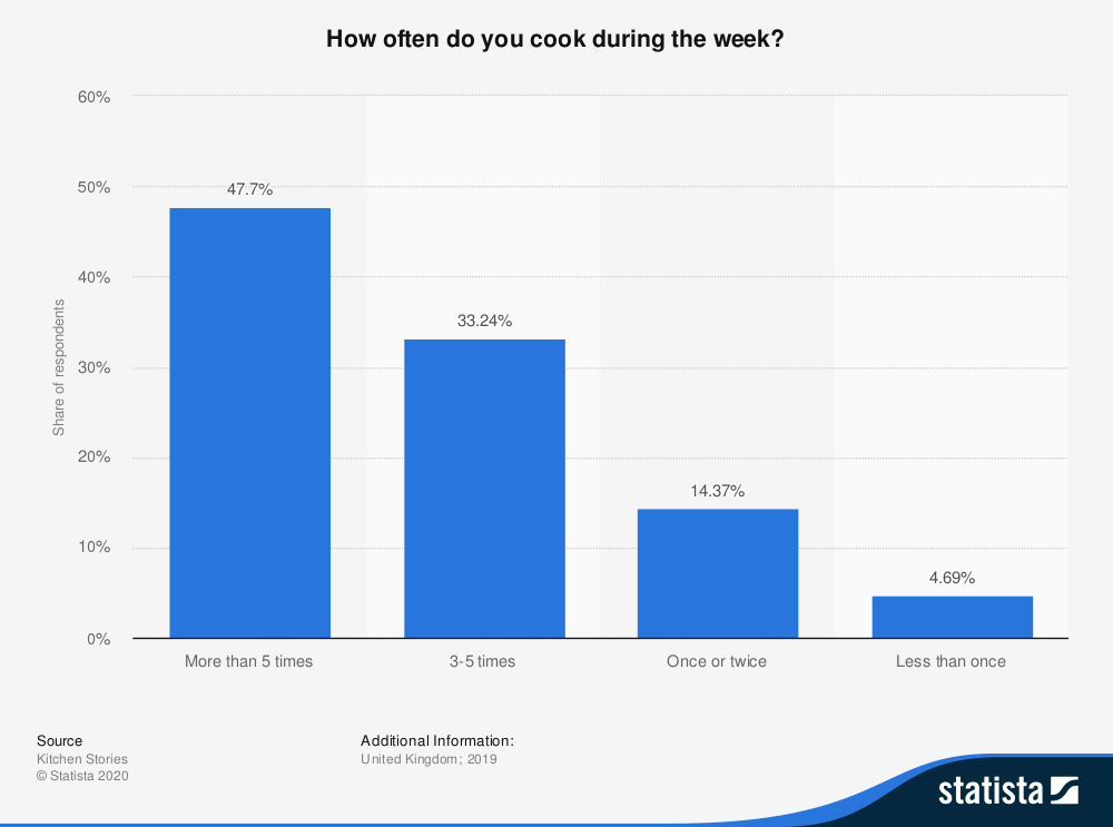
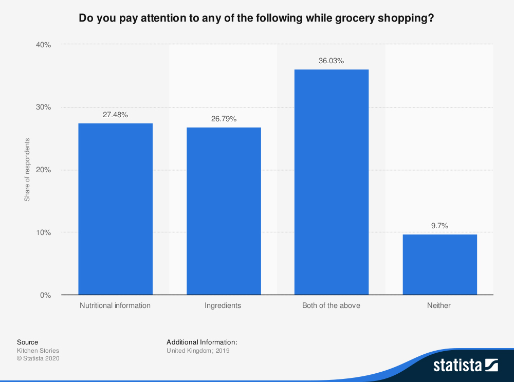
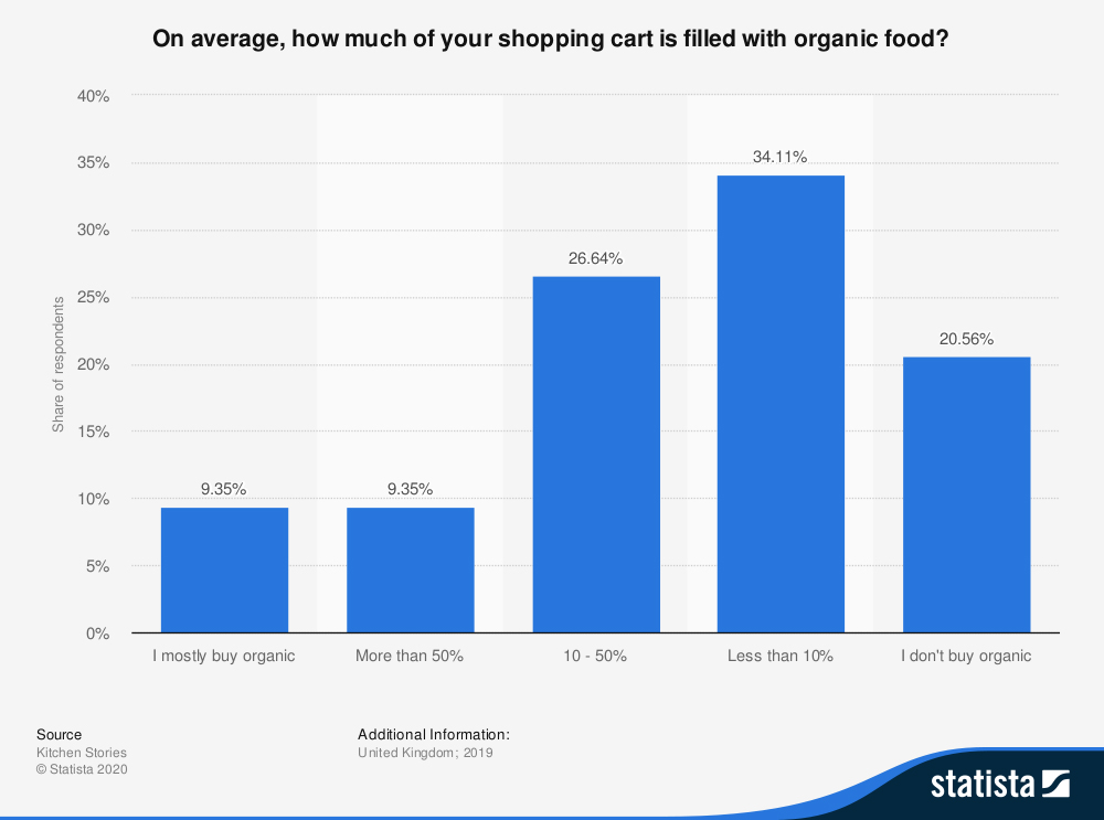
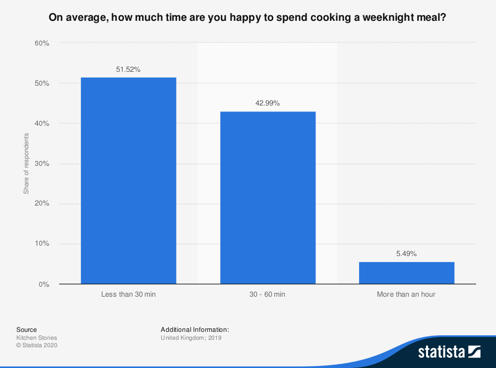
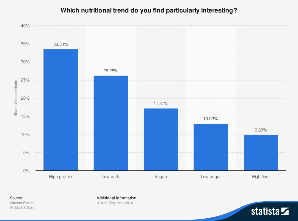
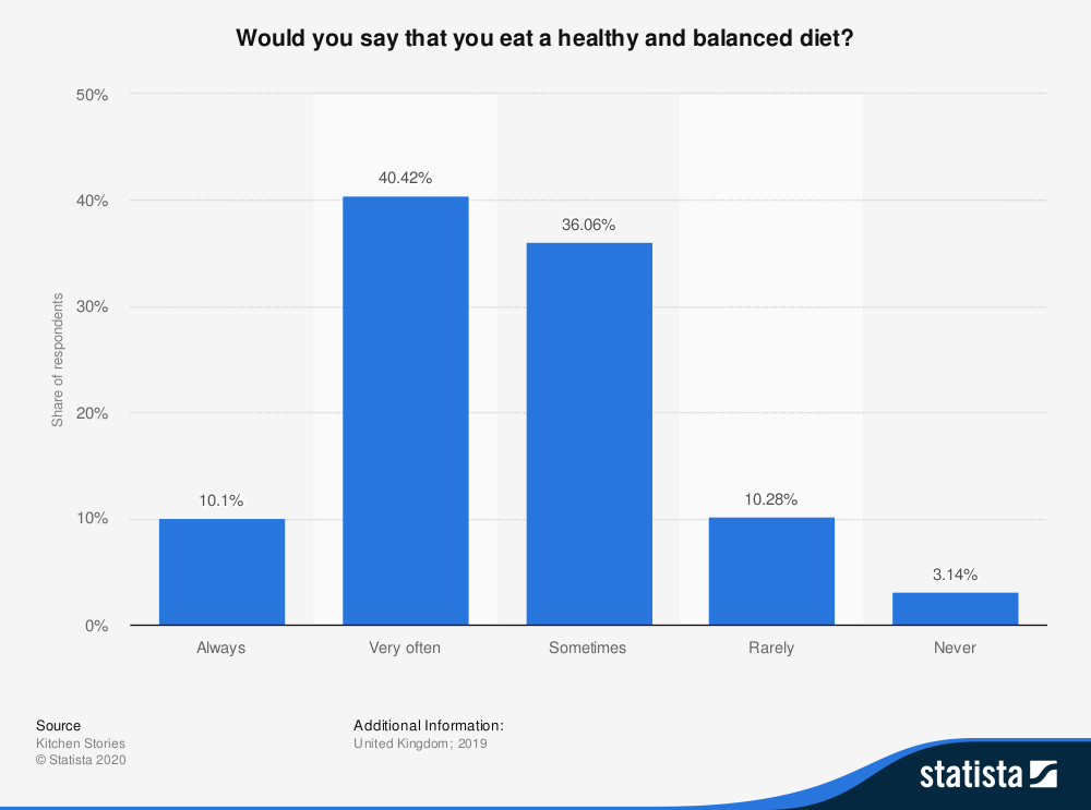
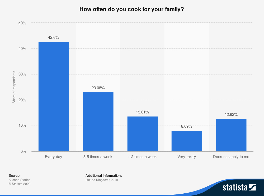
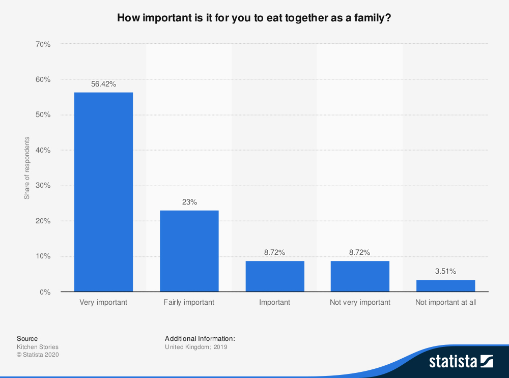
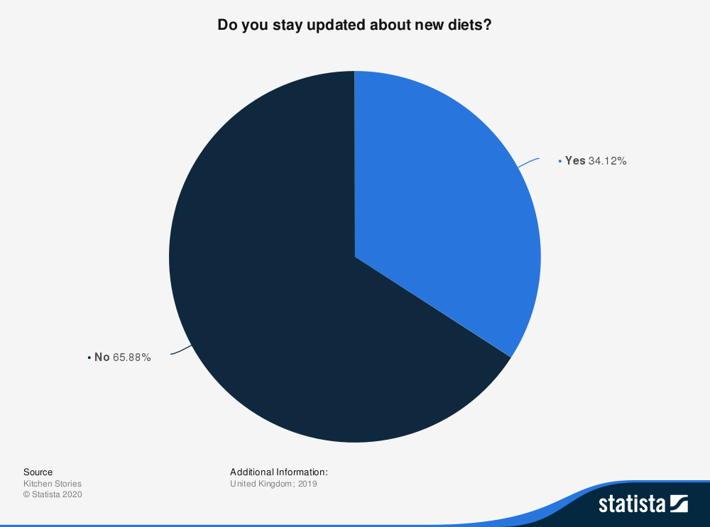
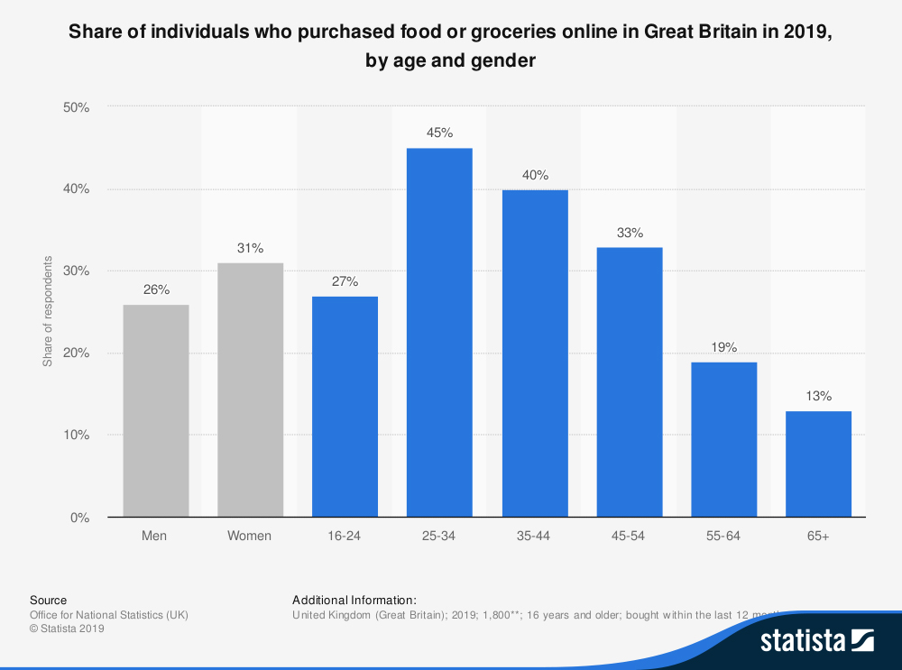
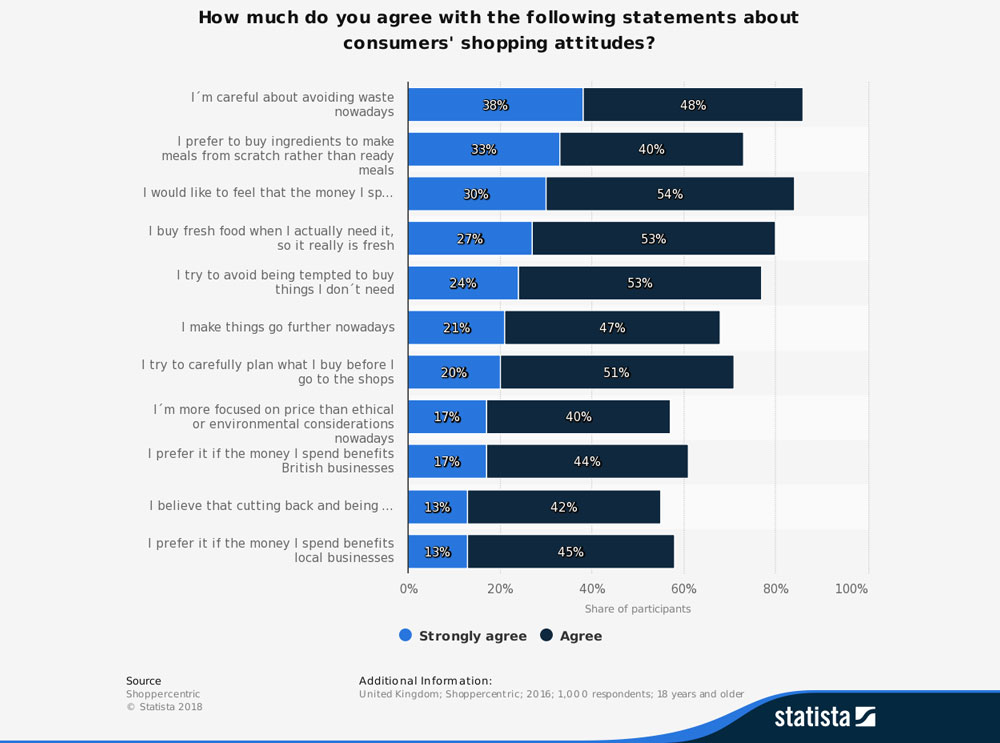
Statistics
A very useful tool at this stage has been Statista.com where I could find data about the groceries shopping behaviour of UK residents from 2019. The information was already presented in graphic chart format, which gave me some supporting facts and hints about the initial stage of the mobile app design.
Design Development
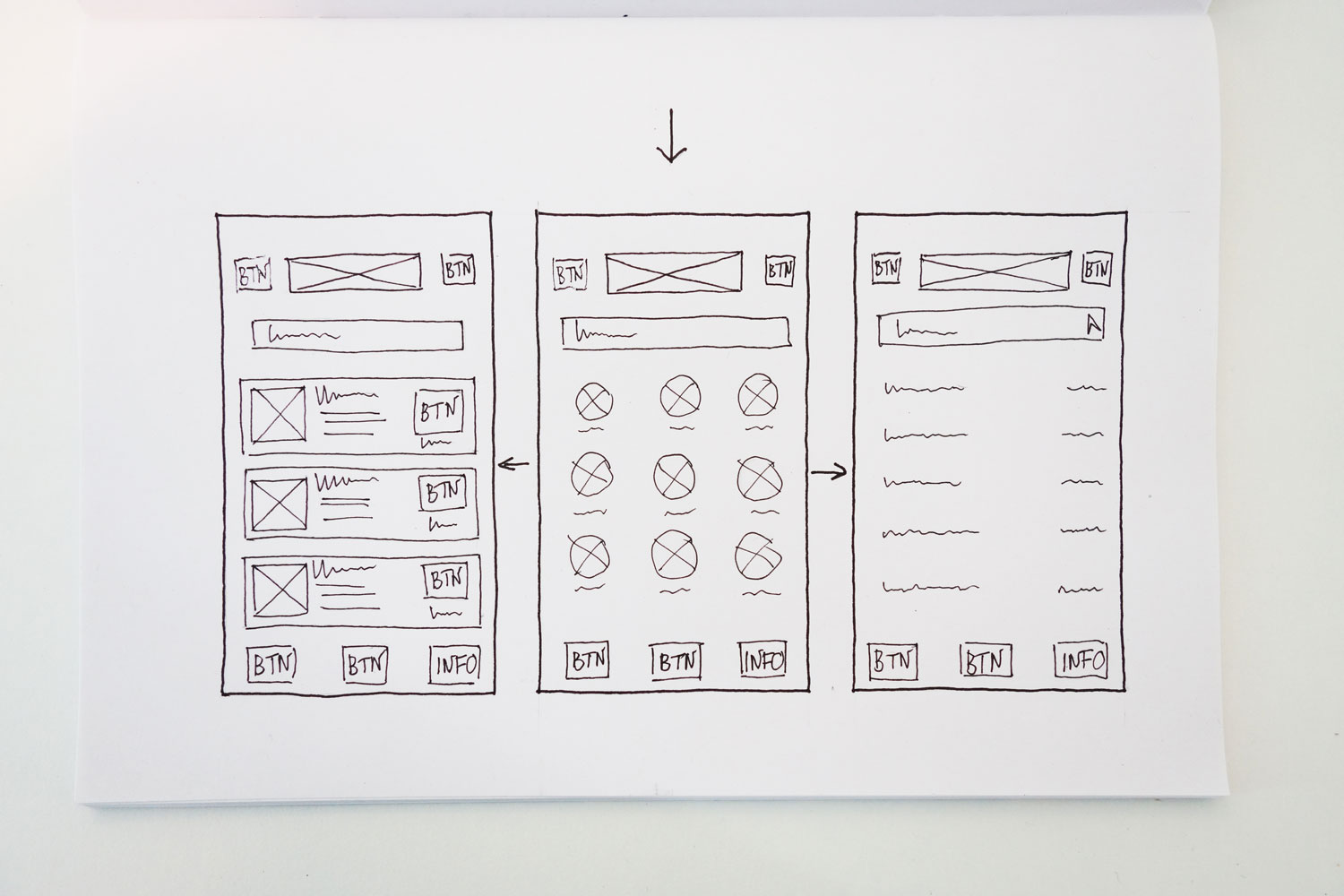
Sketching
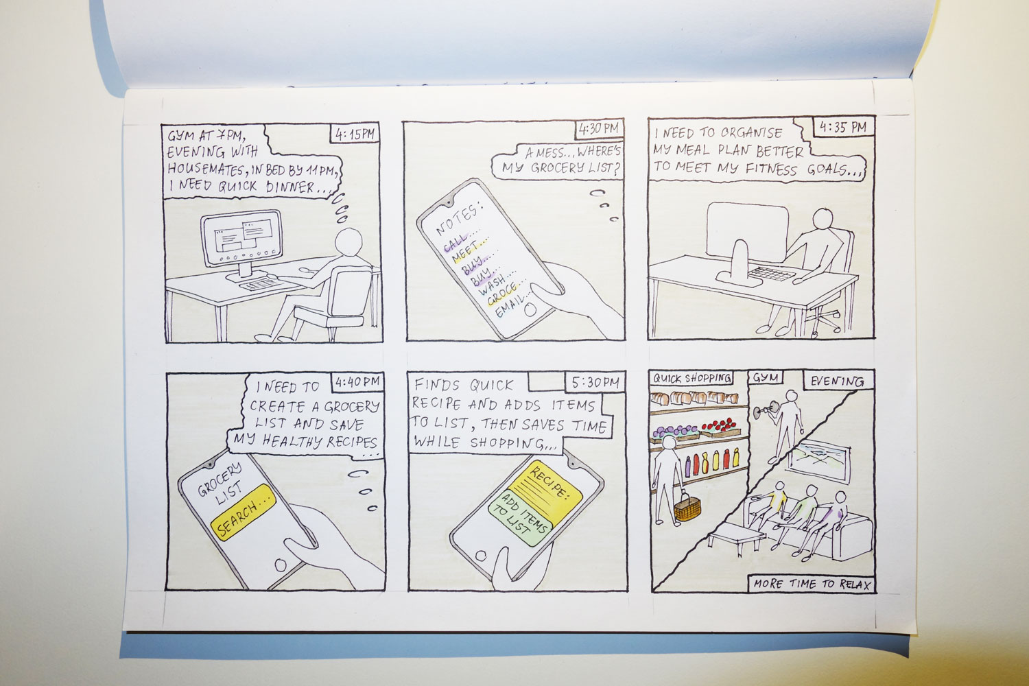
In order to initiale the design process, I created quick storyboard frames and sketches of the main screens of the app so that I could have a starting point for the following user flow diagrams. It gave me a general structure for the main sections and the navigation of the application. In order to support and validate design decisions, at this stage more research techniques and analysis should be involved on real world projects before the start of the actual screen designs.
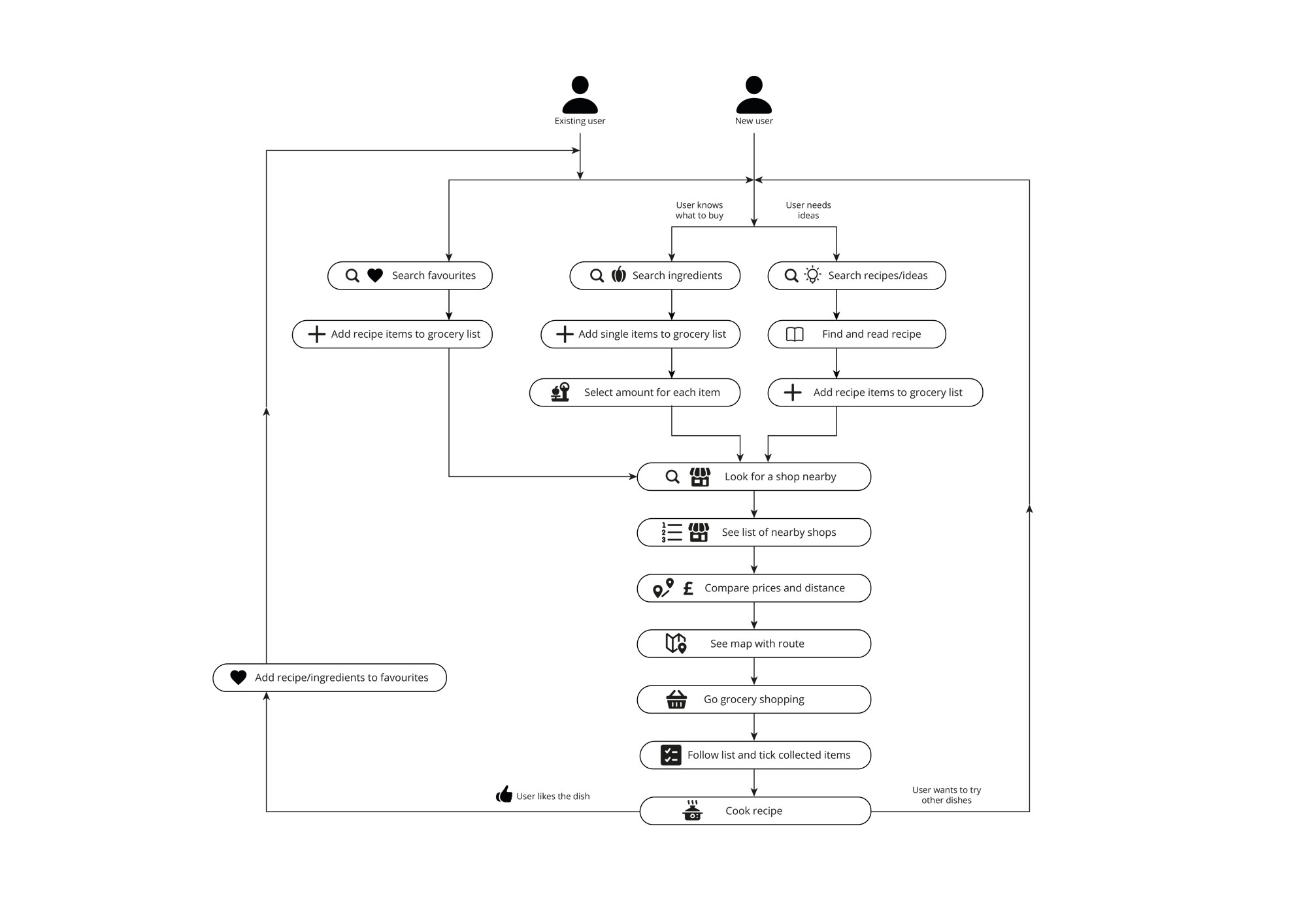
User Flow
Next step was to create a user flow for the main use of the app. The diagram follows the main steps in the groceries and recipe selection for new and existing users. It acted as a skeleton structure for the following prototypes.
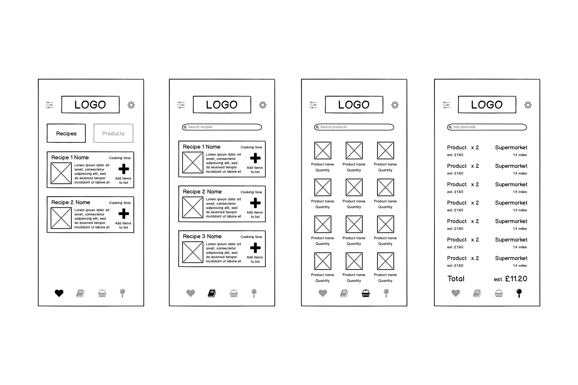
Interactions
After the first step-by-step diagram, I created a user flow with low-fidelity screens to add more detail and use it as a base for the interaction design of the mobile app. It gave me a better understanding of the structure of the app and the number of screens and possible screen states that I have to further develop.
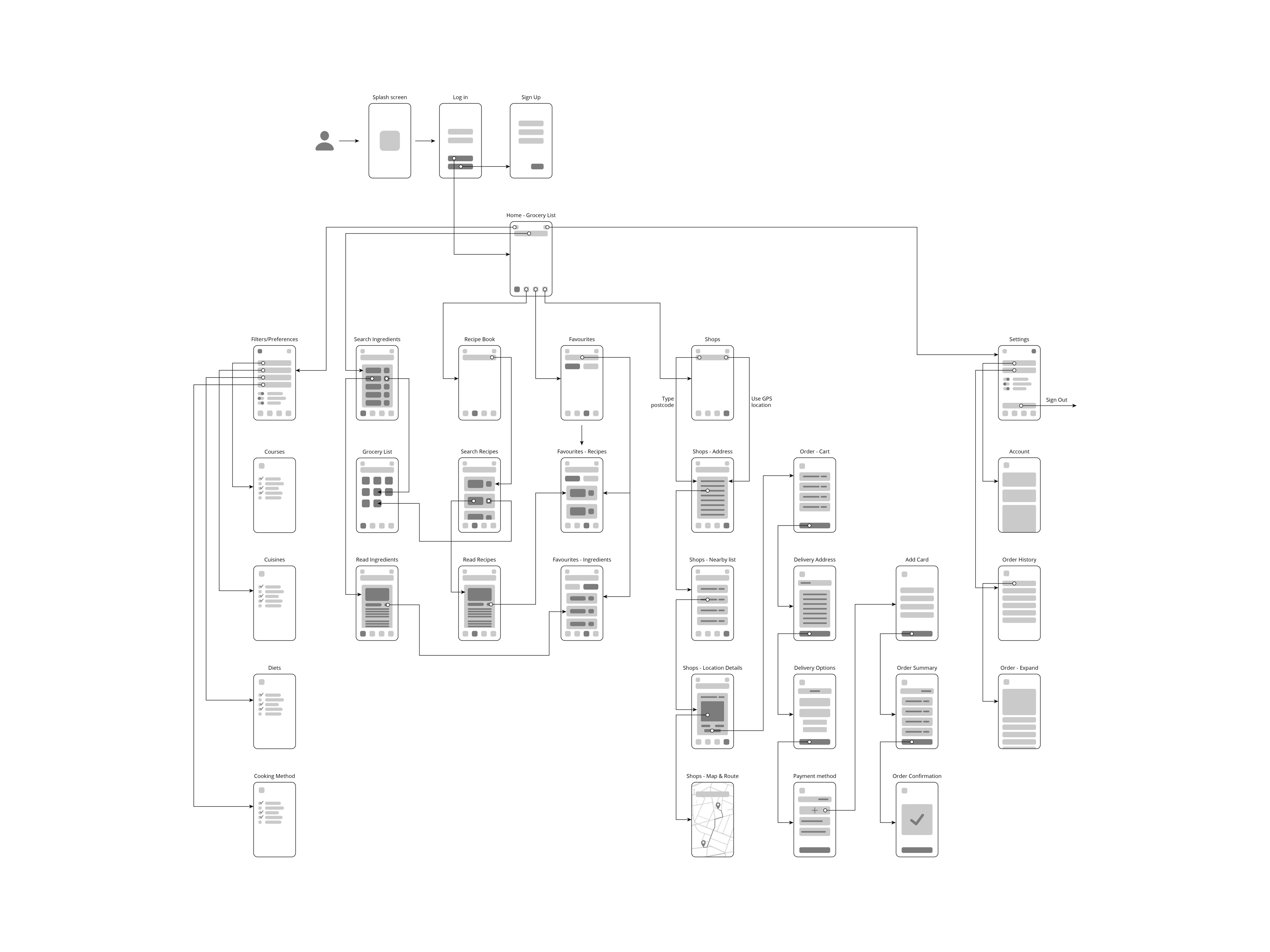
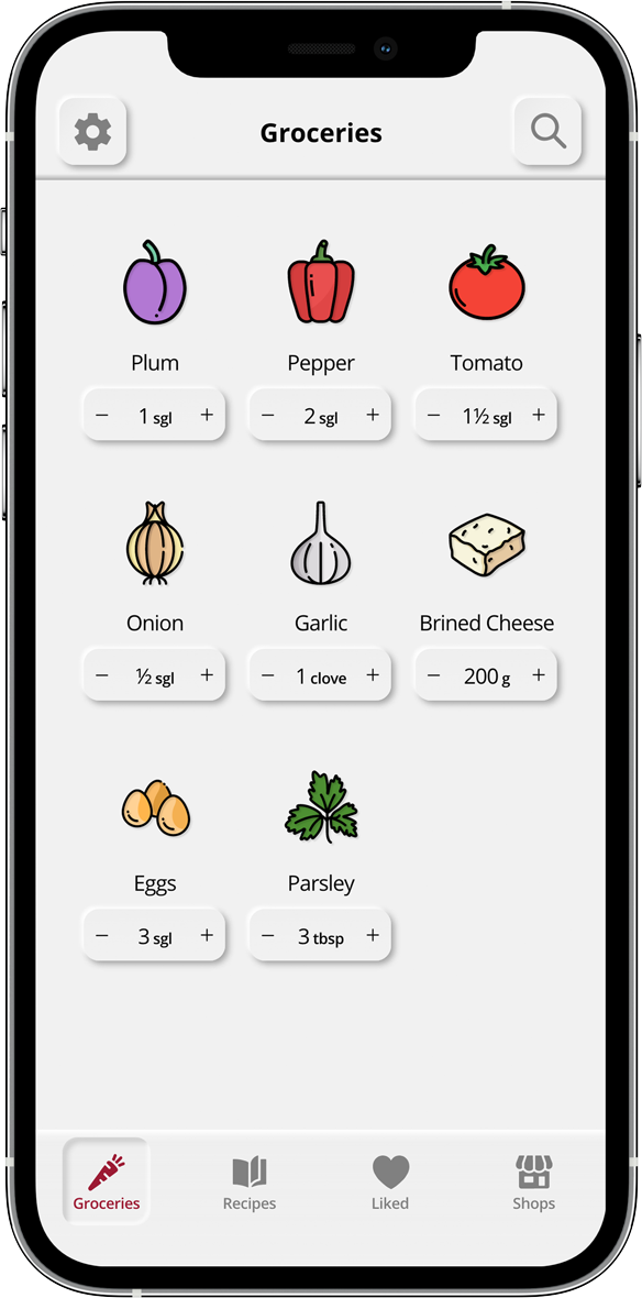
Prototypes
Low-fidelity Prototype
Once the main user flow was clarified I moved to creating the first prototype in Adobe XD to add interactions and test some of the features.
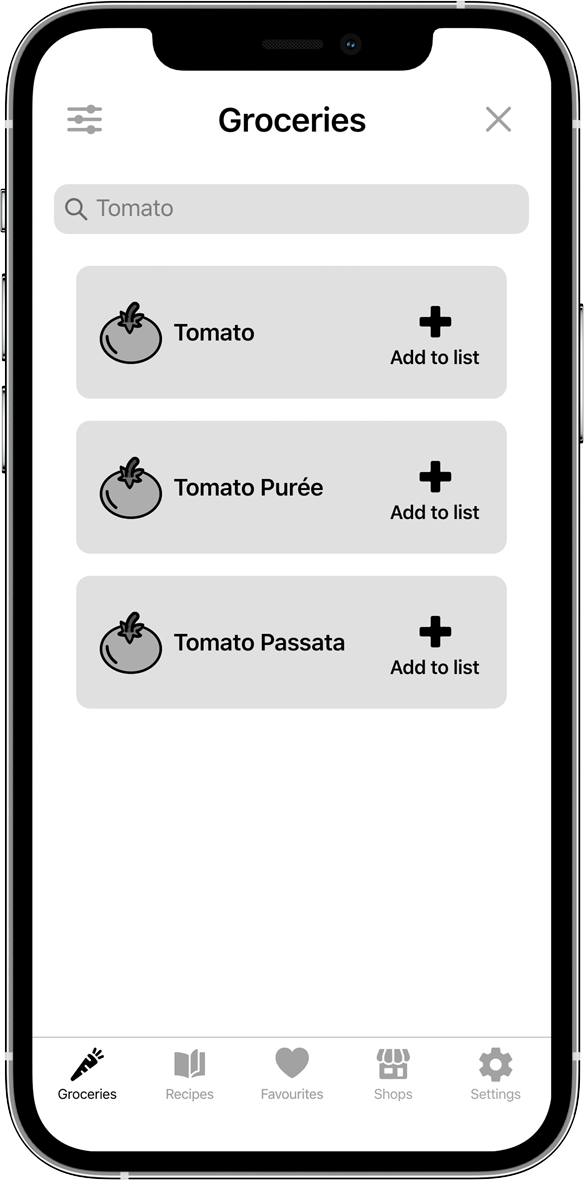
Mid-fidelity Prototype
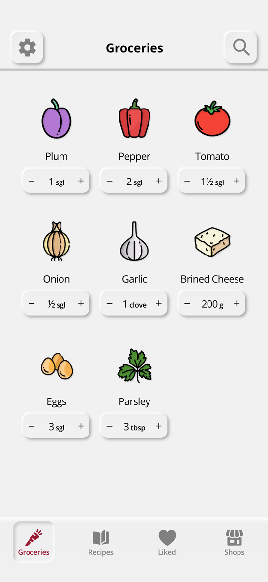
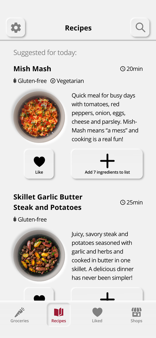
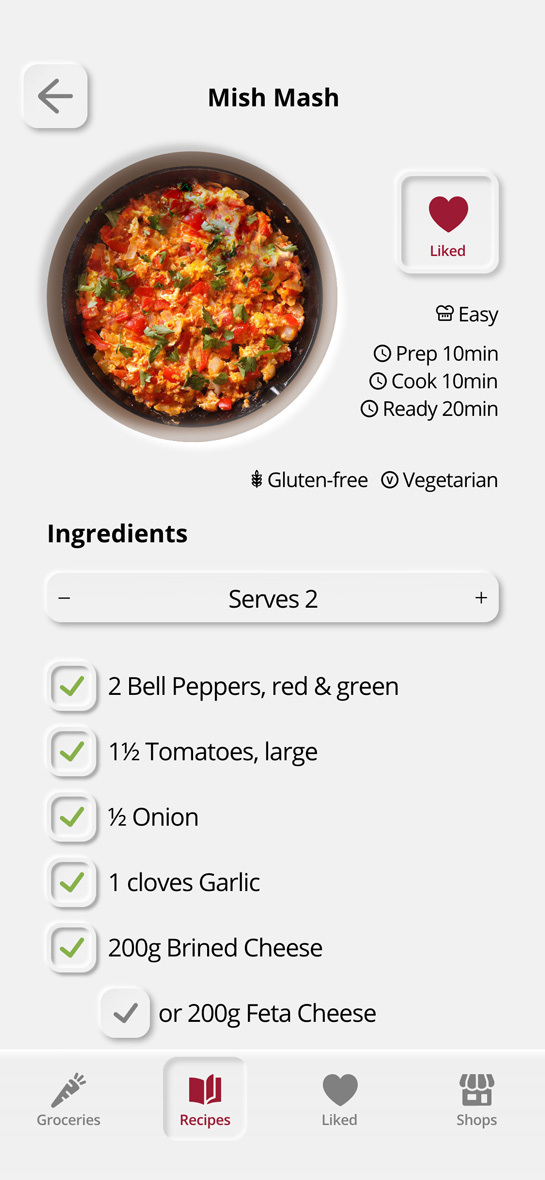
The final step for this project was to create a detailed mock-up of the user interface and a prototype mimicking a finalised application and its most important features.
Next...
What I've learned
This was a quick project and a valuable hands-on introduction to user interface and user experience design. It gave me the chance to get to know human interface guidelines and design themes. After completing the user surveys and moving to the design development of the app, I felt that more research and better understanding of UX principles was needed. That’s what led me to the following Diploma in UX Design course and my further interest in development.
What I would do differently
At this stage I was not informed about accessability guidelines, that’s why some of the design elements may not comply with the standards for contrast. If I have to edit the design that would be one of the first things to revise. I would also spend more time researching the acrual need for a Shops tab in order to validate the further development of this part of the app.
